Anyone who works with game art is probably familiar with tints.
They are one of the most commonly used techniques among game artists and level designers to quickly adjust the visuals of their assets.
To use a tint, you just multiply a color with your existing color information (often coming from a texture): Because it's is a simple math concept, it's easy to add to any material and is often used routinely.
Tints can be used to match colors between multiple assets, create variations to hide the repeated use of the same asset or to fine-tune visuals without the need to adjust the original artwork.
However, as it is often the case with widely used tools, they are often used without making sure that they are the best solution for the given situation. When used incorrectly, they can compromise both the quality of your artwork and the efficiency of your workflows.
The purpose of this article is to point out some of the pitfalls of tints and how to avoid them. And while the hyperbolic title might suggest otherwise, the goal of this article is not to condemn tints in general. Rather, the goal is to raise awareness of when and how to use them properly, rather than routinely applying them to all materials. They are still a valuable tool. They are just used far more often than they should be.
Disclaimer: While the topic of this article is engine-agnostic, I'm an avid Unreal user, so sometimes I'll slip into Unreal jargon or mention Unreal-specific features. But there is usually something equivalent in your game engine of your choice.
Single Source of Truth
Level designers and environment artists love tints to quickly adjust the colors across their levels and adjust the artwork for that final layer of polish that turns individual assets into a cohesive whole. And yes, it's fun to adjust the colors for individual assets throughout your level and tweak the color of each individual instance. The problem with this workflow is that the tint is not the only place in the pipeline where adjustments are made. There are usually a few more:
- The texture artist defines the original color of the asset, usually following an art guide with a defined color palette.
- Engines like Unreal allow you to adjust the colors on textures during the import process. This can be very useful to ensure that a set of textures will work together without having to touch the original artwork.
- The texture can be modified in the material in many ways, but for the sake of simplicity, let's say that the material only applies a tint and returns the result as the base color.
- Once a material is applied to a mesh in a level, the final color of the material is not just determined solely by the material's base color output, but also by the lighting in the scene.
- In most cases, the final image is color-graded in multiple ways. Depending on what's in your post-processing stack, these adjustments can range from simple tonemapping, color grading to the use of LUTs and other shader effects.
Often, artists are unaware of how exactly the final color is achieved and thus adjust the visuals in the wrong place.
Let's say the lighting of a level is overly warm and the lighting artist wants the lighting to be cooler. But instead of reworking the lighting, they adjust the color grading. This can work fine and even look good at first glance, but can cause ramifications down the line: Now the next time the character artist has a look at the characters in the level, the skin got an unhealthy color, so they decide they have to adjust their textures to make sure the characters don't look that pale anymore. Now the lighting, the post processing and the textures are essentially fighting each other, becoming more and more extreme as a result, making every future adjustment a gamble since it's impossible to know how the next adjustment will affect this balance of power.
So when you see the final result in the viewport of your game engine and you don't like what you see, before you make any adjustments, ask yourself the question: Where in the pipeline is the error introduced and where do I want to fix it?
- If the colors of the original texture are just plain wrong, adjusting the original source file or at least the import settings will yield the best results. Otherwise, it's easy to get stuck in a workflow where an identical tint is used on a variety of materials, all doing the same thing, just to fix a texture that doesn't fit the project's color palette. Eventually, another artist is going to use the same texture on another asset, without knowing about the tint they are supposed to use, resulting in inconsistent visuals. Or, even worse: You manage to keep your tints consistent, but then, months or years into the project, it's decided to adjust the game's color palette. Now, instead of just adjusting a single source texture, you find yourself tracking down dozens of materials to adjust all the tints that do the same thing.
- If you suspect the lighting to be the culprit, make sure you have a neutral test scene in which to evaluate your assets. If the asset looks as intended in the test scene, you know that you need to change your lighting. And while PBR has been the standard for game rendering for years now, there are still people who need to hear it: Do not adjust your textures to fix your lighting!
- Be careful with tinting when it comes to lighting. Unreal for example allows you to tint your skylight. While this can be helpful, be aware of the fact that there is usually a reason for the skylight to be the same color as the sky.
- Finally, always make sure that your colors look at least OK without any color grading and post processing. Post processing should only be used for creative choices after the basic visuals are already working, not to fix problems with any of the previous steps.
While this has become a very long paragraph, it boils down to this: Make sure that no matter what you want to change, there should ideally be only one place to change it. Once you start to make adjustments to the same property in multiple places, the potential for unwanted behavior and inconsistencies increases exponentially. So if you don't need a tint, adding a tint option to your materials will only increase this.
In programming, this practice is called the Single Source of Truth. The idea is to always store and edit data in a single place, so that if the data is different than expected, you only have to look for the problem in that one place.
You could argue that this is not strictly a tint-related issue and you would be right. Still, extensively used tints are often one of the reasons why the visuals of a scene become unpredictable.
The Psychology of Tints
An interesting fact about tints is that many people who have them in their toolbox just want to use them. Maybe it's just a sense of fun, maybe it's because level designers are often given finished assets by artists and rarely have the opportunity to live out their artistic ambitions, but if you give people a tint, they'll use it. Even if it's not needed. And that's why you'll often see level designers tinting the grass green, the sky blue and the sand yellow. It's like a natural instinct that's hard to get rid of.
 You'd be surprised how many real-life examples of this kind of tint exist!
The thing about these tints is that they actually hurt the visuals. They may look inconsequential at first sight, but most materials in the real world are not just a plain color. Grass isn't just green, it can also have yellowish tones, brown patches where it grows less densely or even contain completely different colors in the shape of small flowers, pebbles, and so on. Tinting a texture with its predominant color removes all of these subtleties while raising the saturation to levels that are usually unwanted.
It can also hurt image quality, which brings me to my next topic:
Tints don't do what you think they do - Luminance
Tints are often used to adjust the hue of texture, for example, to make a green grass texture appear yellowish. They also tend to increase saturation, as long as the tint color isn't a grayscale value or has a hue on the opposite side of the color wheel.
But since tints are a multiplication, and the used RGB values are usually between 0.0 - 1.0, they also affect the luminance, and the result will always be darker than before.
Why is this bad?
Especially since the advent of PBR rendering, the luminance of a texture isn't something you should change on a whim. With PBR, there are actually 'correct' values for base colors that can be measured in reality. Even if the texture is not based on that, the luminance values of textures within a project should maintain a certain consistency, and if they don't, that's not something to be fixed in a material.
Ok, but what if I still want to adjust luminance?
When adjusting the luminance of a texture, multiplying it by a constant factor isn't the way to go, because it removes all contrast from the texture. Using a tint to halve the luminance of a texture reduces the luminance range of the texture, resulting in a flat, unappealing texture that contains less detail:

It's even worse when using values higher than 1.0, since now we introduce color clipping:

As you can see in the image above, now a whole bunch of bright pixels that previously had different color values in all three channels now reach the limit of the color space and are clamped, resulting in areas that look like a uniform color.
The solution in both of these cases is to use exponentiation. By raising the color values to a power higher than 1.0 (to darken the image) and lower than 1.0 (to brighten the image), we ensure that the value range stays mostly intact and we primarily change the distribution of values in that range.
I really want to use tints, but without affecting the luminance, is there a way to do this?
While it adds some instructions, if you want to be on the safe side, you can normalize your tint before multiplying it with your texture:

This ensures that the luminosity stays roughly the same:

This works fine for rather neutral textures or subtle tints, but there are cases where it won't help:
Tints don't do what you think they do - Channels
Now that we've established that tints can inadvertently break the luminance of your textures, let's take a look at the next level of this problem. In the previous section, I considered luminance to be basically a single value, but as we all know, luminance exists for each channel separately, and it's easy for each individual channel to cause problems. The worst thing you can do with a tint is to try to change a texture to its complementary color.
 Above, you can see how a predominantly green grass texture is tinted with a pure red. As you can see especially well in the desaturated version, the texture is noticeably darker as a result. This is because the green and blue channels of the red color are, not surprisingly, both 0.0.
So these channels of the source color are completely erased.
If a texture is to be used only in combination with tints, this problem can be solved by desaturating it:

Still, the subtle color shifts of the original texture are lost. The original texture had yellow flecks and different shades of green, but all those subtleties are gone. There are ways to preserve these details, described below.
Alternatives to Tints
So far, this article has mostly been a rant about why tints can cause problems. Let's now take a look at better ways to handle color adjustments at runtime:
Hue Shift
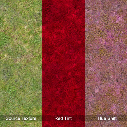
An easy to implement and effective way to add some color variation is a hue shift. Since it only changes the hue, both contrast and chromatic range are safe from unwanted changes. In the example above you can see how the hue-shifted texture still has the characteristic color changes of the source texture, while the red tint just completely erases these details.
The math behind the hue shift is a bit more complex, but still easy to understand and use. Unreal already provides a material function for this, but if you are using another development environment for your shaders, just think of your color as a vector and the hue shift as a rotation.

One problem with the hue shift is that the final result changes drastically depending on the hue of the source texture. So the same hue shift value will produce very different results for different textures.
Use HSV Color Representation
Since using RGB values for color adjustments is not very intuitive and can often cause unwanted side effects, consider converting your color information to the HSV format. It is often easier for artists to adjust these values:

Be careful though, the conversion back and forth between the color representation models does add a considerable number of instructions, so you may not want to routinely add this to all of your materials.
The Agents of Mayhem Way
This technique is more complex than the usual tint, because it requires you to create textures specifically for use with the tint. However, when used correctly, it can produce remarkable results. It was used in Volition's Agents of Mayhem, and was presented and explained in detail by James Taylor at the GDC 2017: https://www.gdcvault.com/play/1024690/-Agents-of-Mayhem-Physically
The technique is based on the insight that one of the biggest issues with tints, as described above, is that tints often clash with the original color of the texture. So what happens if you remove that color from the source texture, only keep the deviations from that color, and then add the color back in the shader? That's exactly what this technique does:

For this to work, you need to have a version of your texture that is basically a grayscale texture, where the only color present is the color difference from the tint color. This color is then desaturated and the difference is used as a mask between the original texture and the tinted version. For all the additional details I highly recommend going through the linked presentation slides; there are some really interesting insights into about how tints work and how they can be used effectively. And while Photoshop is the tool of choice in this case (as the presentation has aged a bit), it can be effectively recreated in Substance Designer and used as a filter in Substance Painter.
Update from 05.05.2025
I was very intrigued by Agents of Mayhem's approach to customizable colors, so I took a lot of inspiration from it when designing the color customization system for Park Beyond. In Park Beyond, the base color texture is authored using a placeholder color and the texture is then processed to only contain the difference to that placeholder color. The custom color is then added in the shader:

As explained in the dev blog, the upcoming game Croakwood uses pretty much the same approach, but uses the OkLab color space, which aims to maintain a consistent perceived luminosity as the hue changes, to ensure that the displayed color better matches the color set by the user.
If you enjoyed this article or found it useful, please share it with others! If you have any comments, questions, or feedback, please post them below. To get informed about new articles, follow me on Artstation, on Mastodon or Bluesky.
You can also find this article on my WordPress blog.