Website powered by

How to find your Stuff on Windows

Tutorial / 23 June 2025

This article is slightly different from my usual ones because it’s essentially just a collection of things I recently learned while searching for files on my PC. Typically, when I write articles, I aim to share obscure knowledge that people haven’t heard about. This article breaks with that approach, as it mostly covers well-known Windows features. Still, I know many people who use Windows Explorer every day to organize their files and aren’t aware of them, so I hope this article will be useful for at least some of them.

The article is split into two parts. The first deals with improving the search function in Windows. The second part shows you how to make navigating Windows Explorer more intuitive by enabling preview pictures for files that don’t have them by default. Hopefully, you will find the information in both parts useful.

Fixing the Search Function

The Situation

I’m not usually concerned with folder structures. Unreal’s Content Browser has a search function that lets me instantly search for combinations of asset names and metadata. Similarly, modern search engines let me access the vast majority of digitized human knowledge in a split second. However, if you ask me to find a file on my hard drive, I’ll probably need minutes, and I can’t guarantee that I’ll find it because the Windows search is not capable of doing so by default.

There are more sophisticated search tools, but you can improve Windows Search by changing a few settings so that it does what it’s supposed to do. Unless otherwise stated, all of the settings mentioned below can be found in Windows Search Settings.

Enable the Enhanced Search

By default, Windows Search only indexes the Documents, Pictures, and Music folders, as well as the desktop. Obviously, there are many other locations in which you may want to find files. You can add additional locations manually if you want to, but I’d rather be safe than sorry. Enabling Enhanced mode ensures that your entire PC is indexed. To do so, open the Windows Search settings and change the “Find my files” option to “Enhanced.”

Don’t exclude the Programs Folder

Another setting to consider: By default, Windows excludes many folders to reduce the likelihood that inexperienced users will stumble upon critical system files. I’m fine with the Windows folder being excluded, but I regularly look into the Program Files folder. The same goes for the AppData folder. Luckily, you can remove these folders from the exclusion list:

Search in More File Formats

This one is more specific and may not apply to you. Windows can search the actual content of text-based files. To do so, it has a list of file formats containing text that can be indexed. Well-known formats like .txt and .rtf are on that list by default. As a programmer, you may want to check that the format of the code you’re writing is also on the list. I had to add HLSL and GLSL, as well as USH and USF (Unreal’s format for shader code), since I write shaders from time to time.

To do so, open the advanced indexing options. The window that opens isn’t actually the one containing the advanced options, though. To open that, click the ‘Advanced’ button. In the newly opened window, switch to the ‘File Types’ tab. There, you will see a list of file formats. For each format, you can select whether Windows should index only the file name or the actual content as well. If you’re working with obscure file formats, it’s a good idea to check this list and extend it if necessary.

Search Content in Non-indexed Locations

Now that both the PC and the file contents are indexed, nothing can possibly slip through, right? Well, not exactly. When working with external hard drives, USB flash drives, or network drives, you often end up searching in unindexed folders. To ensure fast searching, Windows doesn’t search these locations for file contents. This makes sense, but if I have to choose between waiting a bit longer or not getting the results I need, I’ll always choose the latter. Luckily, there is a setting that lets you decide.

Interestingly, it’s not in the search settings. Instead, you have to open the File Explorer Options. The easiest way to access these options is to open the Start menu and start typing their name.

To ensure that nothing is ever skipped, enable “Always search file names and contents” in the Search tab.

Adding More Thumbnails

If you often work with art assets, you may have noticed that, aside from popular formats like PNG or JPEG, Windows Explorer doesn’t display proper thumbnails for them. Regardless of how good your naming convention is, being able to see your assets without opening them is a huge boon and can save you a lot of time.

Windows Explorer without and with Sagethumbs installed

Fortunately, Windows Explorer can use other programs to generate thumbnails. If you’re missing thumbnails for a file format you use regularly, try a quick Google search. Perhaps there’s a tool that can generate them for you.
Below, you can find a short list of tools that I use for this purpose.

For FBX – F3D

F3D is a lightweight 3D viewer. It supports many formats, including gITF, USD, STL, OBJ, and Alembic. Most importantly for game developers, it supports FBX. For several of these formats, including FBX, it can generate thumbnails for Windows Explorer, making it useful even if you don’t use it as a viewer.

For TGA, HDR, DDS - SageThumbs

SageThumbs uses the GFL library, which is also used to display pictures in the popular XnView. Therefore, SageThumbs supports basically all relevant image formats. If you work with image files often, you should give it a try.

By default, SageThumbs adds a new entry to the file context menu. However, I didn’t find any of the features in this menu to be especially useful. If you’re using Windows in dark mode, it’s even broken because it uses a fixed font color.

Black text on a dark grey isn’t the ideal contrast

After installation, your first step should be to disable it in the settings:

As I write this, I can’t help but want to look into the source code. Changing the font color based on the current Windows settings shouldn’t be too difficult, should it? If you’re curious, you can find the source code here.

PDF – SumatraPDF

SumatraPDF  is a minimalist, customizable PDF reader. Or so I’m told. I don’t use it that much, but I install it on every PC I regularly use because it creates thumbnails for PDF files.
When installing Sumatra, open the options and enable “Let Windows show previews of PDF documents” to enable thumbnail generation.

Closing Thoughts

I’m certain that some people reading this are already itching to tell me that there are superior file managers out there (e.g. Total Commander), which outclass the Windows Explorer in every discipline. And while that’s true, I often prefer sticking to the default tools that everyone’s familiar with. Even with the changes listed above, the Explorer can still be used the same way as before. So if I have to use another PC or if other people use mine, file navigation works the same everywhere. It’s just a bit better and more reliable. But please comment below if your experiences differ. Perhaps switching between file managers is less of a hassle than I think, or I’m missing out on features that I don’t even know I want.

If you enjoyed this article or found it useful, please share it with others! To get informed about new articles, follow me on Mastodon or Bluesky.

You can also find this article on my WordPress blog.
Tutorial: Laplacian Texture Blending in InstaMAT

Tutorial / 22 March 2025

As mentioned in my last article, a tutorial on how to implement Laplacian texture blending in Substance Designer, I’m not exactly happy with Adobe’s licensing options, or recent changes to their terms of service. So I looked for alternatives, and quickly found InstaMAT, another node-based texture creation software. InstaMAT is free for individuals or companies with a revenue smaller than 100.000€/year, and there are perpetual licenses available, which I always prefer to subscriptions. To test it and see how well it works for me, I opted to implement Laplacian texture blending in this software as well. This is how this article came to be.

If you own InstaMAT, this tutorial is hopefully helpful to you as it shows you how to implement Laplacian texture blending, a helpful technique when creating composited materials. If you don’t, it’s hopefully an interesting look outside the box that is Substance Designer.

What is Laplacian Texture Blending

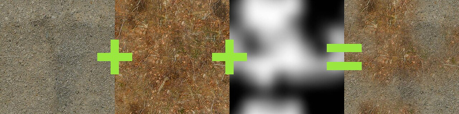
One of the most common operations when authoring materials is blending together different textures using a mask. It's a great way to create new textures by combining existing ones, or to have more options for adding variation during rendering.

But very often when you use a soft mask, this is what you get:

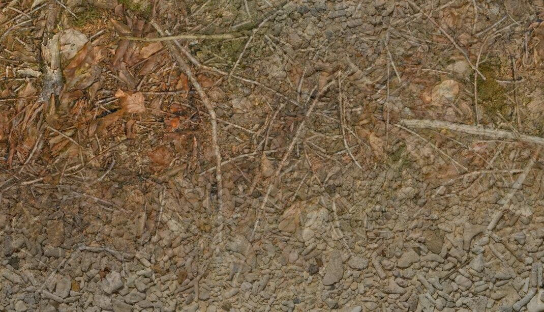
Both textures, the forest ground texture and the pebbles texture, are simply layered on top of each other, and details such as sticks and pebbles are noticeably transparent. Also, in the areas where the textures are displayed with reduced opacity, the effective contrast of the resulting texture is noticeably lower than in the areas where only one texture is displayed.

There are several ways to fix/improve this situation:

  • Using height-blending, you can create a mask that is affected by the heights of the details. This allows you to use a higher mask contrast without creating a noticeable edge.

  • You can increase the contrast of the result in the blended regions based on the opacity of the source textures to maintain an even contrast throughout the texture.

Neither solution is perfect. Increasing the contrast in the blended areas doesn't fix ghosting. And height blending is only an option when height maps are available, which isn't always the case. And even then, its usefulness depends on fine-grained, noisy height maps, and on all contrasty details actually being present in the height map. So if a material has a lot of details in the base color that aren't present in the height map, height blending won't help preserve them during blending.

Another approach to this problem was recently proposed by Bart Wronski, research scientist at Nvidia. It got published here in the Journal of Computer Graphics Techniques. I highly recommend reading it because it has two very strong qualities: It's a) very clever and b) relatively simple once you understand how it works. The technique is called Laplacian texture blending, because it uses a Laplacian Pyramid. I won't describe the technique in detail (that's what the paper is for), but the basic idea is that instead of blending the two textures with one mask, the textures are split into several frequency bands. These frequency bands are then blended together using separate masks. The high frequency bands are blended with a high frequency mask, while the low frequency bands are blended with low frequency (read: blurred) versions of the mask. This way, the contrast of the small details in the textures is preserved, while the low-frequency elements, such as the dominant colors, are blended very softly.

Let's see what the result looks like:


Compared to the classic blend, ghosting is dramatically reduced. Details remain intact and distinct, and local contrast remains consistent throughout the texture.

A few notes first:

  • This tutorial explains how to implement the technique with a fixed number of mip levels. If you're actually going to use this in production, I would recommend letting the user control the number of levels so they can control how soft they want the blend to be.

  • Since the tutorial only covers how to implement the technique in InstaMAT, I highly recommend reading Wronski's paper to understand how the technique works before starting the tutorial, as I won't go into the details.

Step 1 - How to separate Frequency Bands

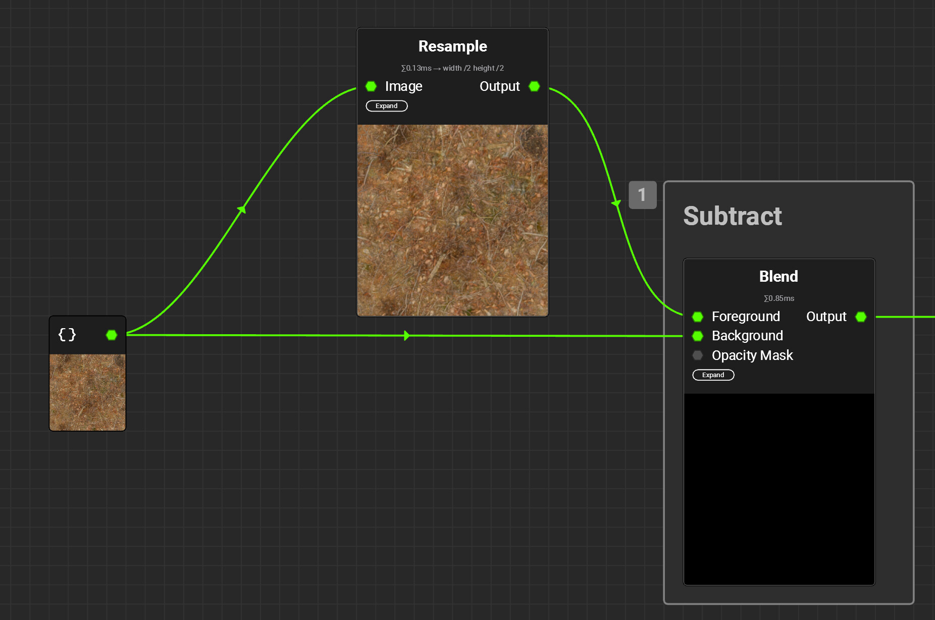
The first step is to separate the frequency bands present in the mip maps of the input textures. Due to the smaller resolution, each mip map in the chain loses the highest frequencies, as there are not enough pixels anymore to display them. Therefore, you can isolate these frequencies by subtracting the smaller mipmap from the bigger one:

As you can see in the screenshot, the result is quite dark, as the differences between the two mips are really small. Even worse, the differences can be both positive and negative. This makes it slightly more complicated to work with them, since they aren’t visible by just looking at the node’s output. By default, InstaMAT even clamps the output values between the 0-1 range, because when it comes to images, we usually don’t want values outside of this range. Thankfully, the clamping can be disabled in the node’s settings:


Note that I also disabled the sRGB setting. This setting is really important, as adding and subtracting details doesn’t work in a gamma-corrected color space. So for the rest of the tutorial,make sure to disable sRGB on all used nodes.

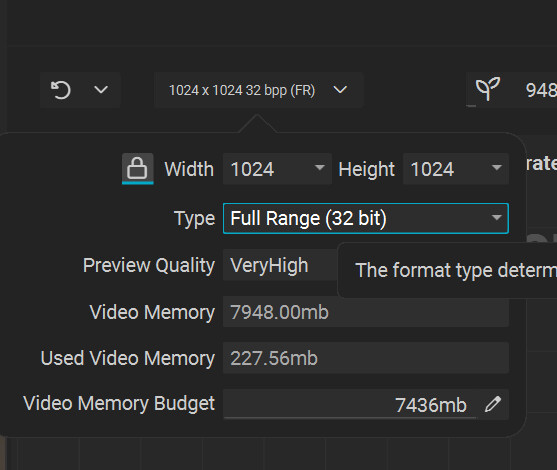
Additionally, you also need to change the format type of the project from the default, Normalized, to Full Range, otherwise the clamping being disabled on individual nodes doesn’t do anything:

Step 2 - Getting all the Levels

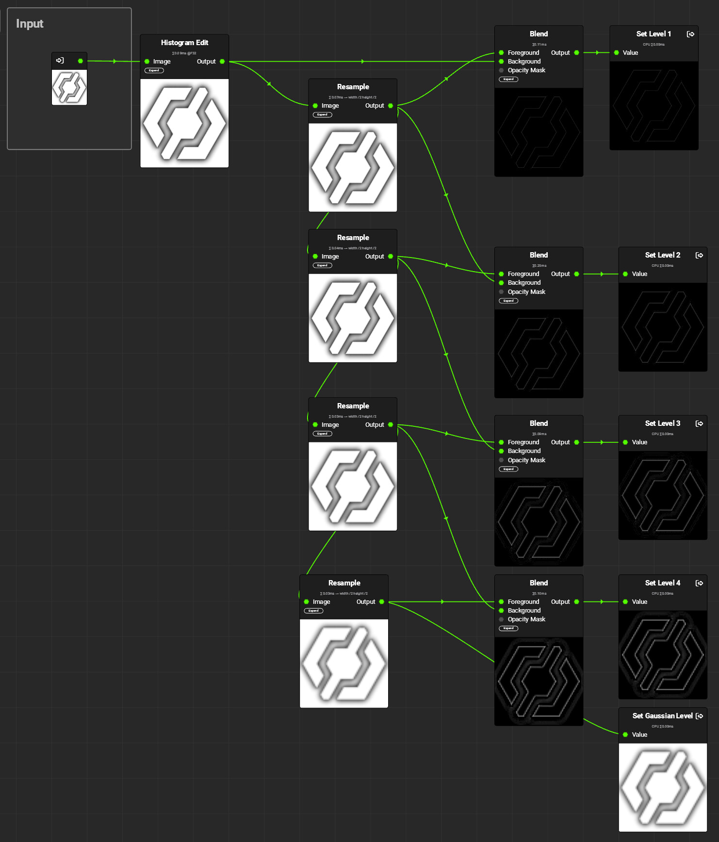
Once the basic setup to get the frequencies of individual mipmaps works, it's time for some copy and paste:

In this graph, the previously used Image node is now replaced by an Input parameter. Each frequency band is connected to a separate Output node. Note that I’ve named them Levels 1-4. Both terms, frequency bands and levels are correct, as the frequency bands are the levels of the Laplacian pyramid. Finally, the smallest mipmap, called the Gaussian Level, is output without any modifications. It contains all the lower frequencies not present in the diffs above. It's up to you how many levels you want to use, depending on how smooth you want the transition to be. Each step makes the blend softer. As the number of needed levels depends heavily on the dominant frequencies of both the textures and the mask, I recommend exposing the number of levels as a parameter to the user.

Step 3 - Blending the Frequencies separately

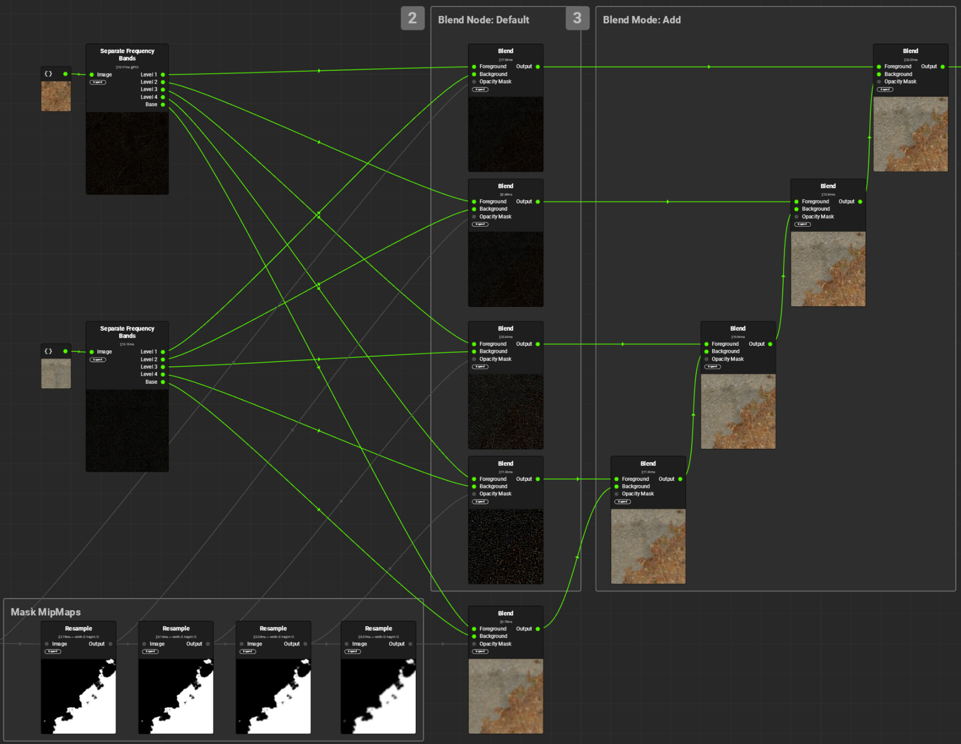
Now that you have separated the frequency bands, blend them separately. Start with the Gaussian Levels and blend them using the appropriately mip-mapped mask. The frequency bands are blended in the same way. For each blend, the appropriate mask mip map has to be used. The one with the highest frequencies uses the full resolution mask, the next uses the half resolution mask, and so on.Then all the blended frequency bands are added to the blended Gaussian Levels.And that's it, you're done. Just replace the images and mask with Input parameters and you can use the finished graph just like a classic blend mode:

A word of advice for when you try out this technique: Since the mask is only blurred, not sharpened, the contrast of the original mask will dictate the highest possible contrast in the blended result. I'd recommend using masks that are either completely binary or close to it.

Performance

Since creating textures in InstaMAT doesn't need to be done in real time, performance wasn't a high priority for this implementation. I didn't look into performance improvements like skipping layers, and outputting the individual frequency bands at full resolution is obviously an oversight that should probably be fixed. If you're using this implementation multiple times in an already complex material, you might want to do that, but I was already quite happy with the graph as shown above.

About InstaMAT

When it comes to procedural texture creation, Substance Designer is undoubtedly the industry standard. So if you are wondering whether to use Substance Designer or InstaMAT, the deciding factors are probably not technical. InstaMAT offers pretty much all the nodes and features you'd expect, and was clearly developed in a world where Substance Designer already exists. The UI is quite similar and feels very familiar if you're used to Substance Designer, so you won't have much of a learning curve. I was up and running in a matter of minutes. There were a few situations where I had trouble overcoming some muscle memory I had acquired over the years (double-clicking a node in InstaMAT would open its graph, whereas in Substance Designer it would only update the preview), but in general it was a very smooth experience. That said, I can't really say anything about more advanced features that might be critical in a professional environment, such as version control integration or tooling and automation options.The biggest advantage of Substance Designer is the myriad of existing users who share their creations, plug-ins and techniques, write or record tutorials and help each other with bugs and problems. 

So would I recommend InstaMAT over Substance Designer? If you're eligible for the free version and don't have the biggest budget, I can easily recommend it. If you're not and need the tool in a professional environment, Substance Designer is probably the safer option. Still, I'd recommend giving it a try. Experienced texture artists won't have trouble getting used to it, and if you want to be less dependent on Adobe, InstaMAT is a viable alternative.


If you enjoyed this article or found it useful, please share it with others! If you have any comments, questions, or feedback, please post them below. To get informed about new articles, follow me on Artstation, on Mastodon or Bluesky.
You can also find this article on my WordPress blog.

Tutorial: Non-Invasive Engine Changes in Unreal

Tutorial / 23 February 2025

One of the upsides of working with Unreal is that you’ve the option to look at the source code and change it if necessary. But once you start working on bigger projects, this actually something that you learn to avoid, as it does bring some downsides:

  1. If your project takes longer than just a few months, you’ll probably want to update your engine version a few times, to take advantage of newly released features or to get fixes to existing bugs. But with every change you make to the original source code, updating to a newer version becomes more complicated because you have to merge your own changes with the changes made by Epic’s developers. Even trivial changes can make the update process significantly more cumbersome once they start to pile up. 

  2. Once the project is finished, you can't take your changes with you to the next project without combing through the engine's source code and copying over each change. This can be especially challenging if your changes consist of a number of changes in different classes that are interdependent, so you have to track them down one by one.

  3. If you're working on multiple projects in parallel, each using its own version of the engine, you can't share these changes, so you have to make and maintain them for each project individually.

Thankfully, in many cases, these problems can be fixed using an Unreal feature called Core Redirects.
They allow you to redirect references to functions, classes, structs or properties to other ones at load time, without the need to re-compile your code when you choose to disable them again. So instead of changing a class, you create a child class of it. In this class, you can override functions of the original one, add variables or change the default values of variables, etc. Note that the tutorial below only covers class redirects, and have a look at the documentation below which other types exist and what they can be used for.
While core redirects are already a powerful feature, they get even better when you put them in a plugin, so that you can toggle them with the click of a button!

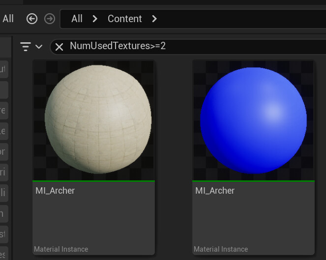
Below are all the steps required to create a toggleable core redirect that adds an additional asset registry tag to material instances. This tag tells the user how many textures are used by a material instance, making it easier to identify instances that are going overboard.

Step 1 - Creating the Plugin

First, create the plugin that will store your modified classes and the core redirects. This is very simple, just open the plugins window (Edit -> Plugins), click on the Add button and select the Blank template. Give your plugin a fitting name and description. After creating the plugin, Unreal will prompt you to restart the editor, then you’re done.

Step 2 - Creating the Child Class

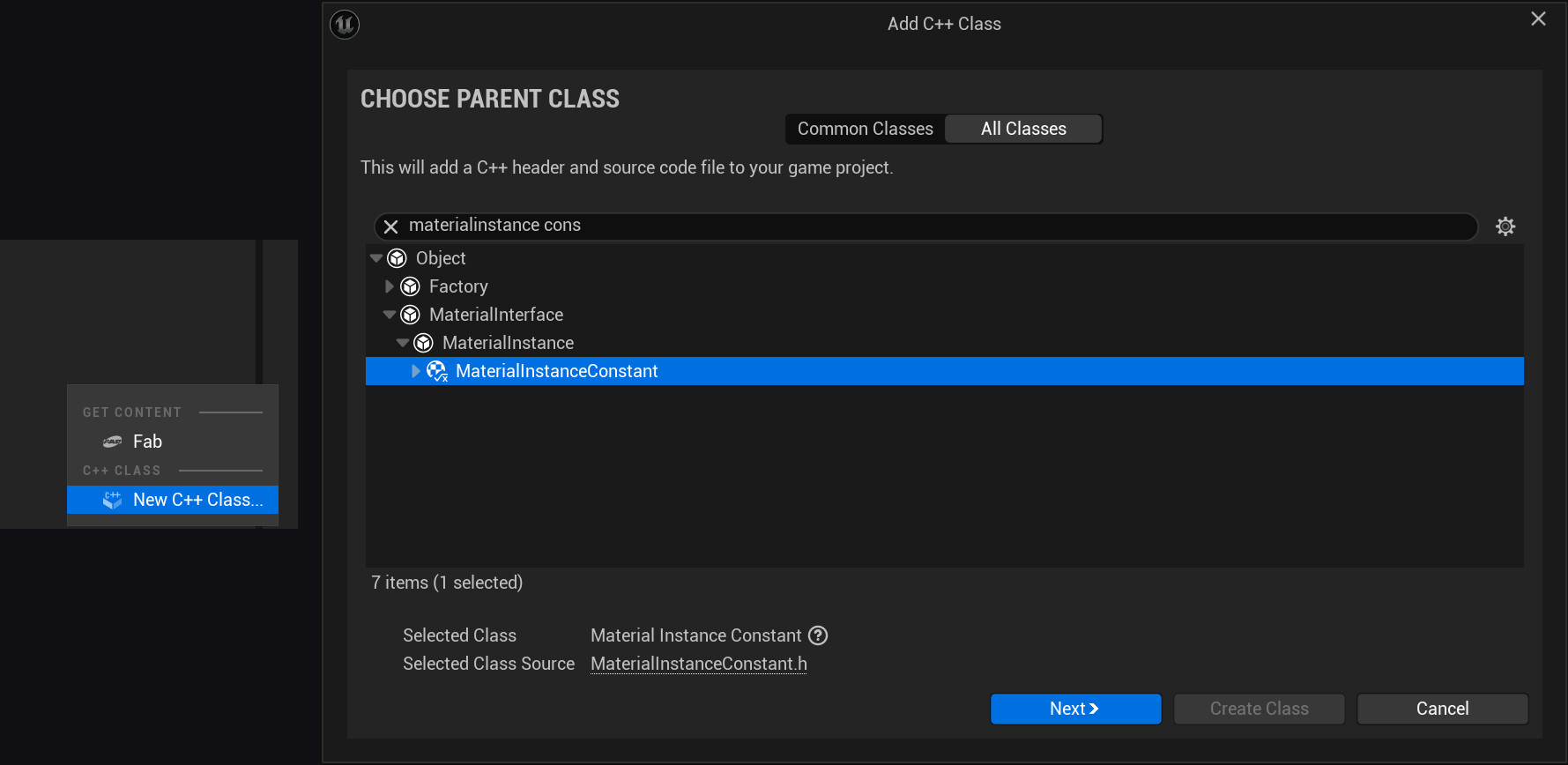
Now create a new class, right-click anywhere in the Content Browser in a folder containing C++ classes and select the option New C++ Class….


In the Add C++ Class wizard, select the parent class, in this case material instance constant, and select the folder of the newly created plugin as the location of the new class. Also make sure that the new class is public, and choose a fitting name. For this example, I didn't want to be overly inventive and used the default name MyMaterialInstanceConstant. Close the editor and open your new class in Visual Studio.

Step 3 - Adding the Asset Registry Tag

To add additional asset registry tags, first you need to indicate that you want to override the existing GetAssetRegistryTags() function. You can do this in the header of your new class, using the override keyword:

In the source file, add the actual implementation:
Since Unreal already provides the GetTextures() function, it’s very simple in this case. Important: The function still calls the implementation of its parent (Super::GetAssetRegistryTags). This call makes sure that aside from the logic added in the child class, material instances still behave the same as before.

Step 4 - Adding the Core Redirect

Now that the new class and the override function are in place, you still need to tell Unreal to use it as a replacement for the original one. To do that, navigate into the folder of your new plugin. It’s located in your project folder, in Plugins/[NameOfYourPlugin]. In my example, it’s Plugins/AdditionalAssetTags.
In that folder, create a Config folder, and place a config file in it. This config needs to be named Base[NameOfYourPlugin].ini. In this file, add these two lines, replacing MyMaterialInstanceConstant and AdditionalAssetTags with the names of your class and plugin:

[CoreRedirects]
+ClassRedirects=(OldName="MaterialInstanceConstant",NewName="/Script/AdditionalAssetTags.MyMaterialInstanceConstant")

These lines will redirect any reference to the MaterialInstanceConstant class to your newly created child class.

Step 5 - Adjusting the Loading Phase

Since the redirector changes Unreal’s behavior when loading assets, it needs to be loaded before the affected assets are loaded, otherwise redirecting the references will fail. To do this, open the .uplugin file of the created plugin (Plugins/AdditionalAssetTags/AdditionalAssetTags.uplugin), and change the LoadingPhase setting. The LoadingPhase enum controls when a plugin is loaded. For plugins containing redirectors, it needs to be set to EarliestPossible:

Step 6 - Testing the Result

Open the editor and check the tooltip of some of your material instances:

You can also use the search bar to use for specific tag values:

And, interesting in this case, you can even sort by tag:

Note: The asset registry tags are only created when assets are loaded. So for the search to give you complete results, you need to select all existing material instances in the project at least once. The tags then get saved for later, so you only have this to do whenever you create or change tags.

Step 7 - Disabling the redirect

Your engine change now works as expected, so the tutorial could end here. But of course there's a chance you might want to disable it again for some reason, and since the promise of this tutorial was to make the engine change non-invasive and easy to revert, let's see how that works.
At this point, simply disabling the plugin will cause problems if any assets that had their class changed as a result of the redirection have been saved in the meantime. That's because they were saved as the new class, and when the plugin is disabled, that class no longer exists. Fortunately, you already know the solution to this: 
Another core redirect.

In the plugin's config file, comment out the previous core redirect (you want to keep it around to enable it if needed) and add a new one pointing in the other direction:

[CoreRedirects]

+ClassRedirects=(OldName="/Script/AdditionalAssetTags.MyMaterialInstanceConstant",NewName="/Script/Engine.MyMaterialInstanceConstant")

Now launch the Editor, locate any assets that use your custom class, and resave them. The resaved assets will now use the default class again.
Now you can safely disable the plugin again. Your engine change is gone without a trace.

Disclaimers

While core redirects are a handy tool in many situations, they do have some limitations.

  1. Redirects are evaluated when loading assets, but not when creating new assets. In the material instances example, the number of textures is displayed correctly for existing instances, but not for instances created later. To fix that, you can either restart the editor or reload the assets (Asset Actions -> Reload).

  2. If you use a lot of redirectors, you may end up with multiple redirectors for the same class. In this case only one of them is used. So use them sparingly and check the existing core redirects in BaseEngine.ini to avoid conflicts.


If you enjoyed this article or found it useful, please share it with others! If you have any comments, questions, or feedback, please post them below. To get informed about new articles, follow me on Artstation, on Mastodon or Bluesky.

You can also find this article on my WordPress blog.

Mip Flooding in Substance Designer

Tutorial / 11 August 2024

Especially if you happen to use a slow Internet connection, you may have noticed that modern games are larger in file size than ever before. And if you happen to be a game developer, this is something you need to be aware of, as it can discourage people from downloading and playing your game, either because they're not willing to wait for your game to download, or because they simply don't have enough free space on their hard drive.

There are many ways to reduce the size of your game, and one technique that is effective and surprisingly simple is mip flooding, which allows textures to be compressed more effectively. In this article, I'll explain how it can help you keep your game small and how to implement it in Substance Designer.

What is Mip Flooding?

Mip flooding was first used in the 2018 God of War reboot and was showcased at GDC 2019.

The technique adjusts textures so that they can be compressed more effectively. The less detailed a texture is, the smaller it can be after compression. With UV-mapped textures, there are always pixels that are not actually part of a UV shell, so replacing them with a flat color can significantly reduce the size of the compressed texture. To do this, simply create a mask based on your UV layout and use it to replace pixels outside the mask with the flat color.

Unfortunately, since textures are usually mip-mapped, this will lead to visual errors, as the flat color will bleed into the UV shells in smaller mips.

Mip flooding solves this problem: Instead of just using a flat color, the area outside the mask is replaced with the next mip map in the chain, mip1, which uses only half the resolution. Then the process is repeated inside this area, but this time using the mip1 of the mask and filling the unused area with mip2. This process is repeated until the last mip.

As a result, the texture only contains as much detail as is actually needed when used in the game, but can be compressed much more effectively. By the way, I'm talking about the compression used to store the textures on disk, not the compression used to store the textures in memory at runtime. The compression techniques used at this stage prioritize speed, not compression ratio. 

Therefore, the algorithm is much simpler and the compression ratio is fixed and does not change depending on the texture content.

You can find a more detailed explanation of the algorithm in this article written by Sergi Carrion, who implemented Mip Flooding in Python. I strongly recommend that you read it before continuing with my article, as it inspired mine in many ways, and I'll skip many details that he already covered.

Why Substance Designer?

Sergi Carrion's Python implementation, available on GitHub, is already easy to use, and depending on your needs, it's probably exactly what you need. The fact that it's written in Python makes it versatile and usable in many contexts. Still, most artists I know don't like to introduce new tools into their workflow, preferring to use the tools they already know. And as luck would have it, Substance Designer, a software that is very popular among texture artists, has all the features needed to implement mip flooding without any additional tools.

The Implementation

In the following paragraphs, I'll cover the implementation and explain how it works. I'm assuming that you're already familiar with Substance Designer, so I won't go into detail for each step, but I'll try to be as concise as possible without being cryptic.

Note

After I originally published this post, Jan Ortgies contacted me and pointed out a problem with the original implementation that caused colors from outside the masked area to bleed into the result. To fix this problem, the pixels of the mips have to be weighted with the mask. For a more detailed explanation, take a look at his pull request.

He also changed the way the mask is used, treating it as a binary, causing the original edge colors to be spread out further. So I edited the article to include his improvements. I also recommend that you check out his C++ implementation, which may be a better fit for you, depending on your pipeline.

The Flood Layer

Mip flooding is basically repeating the same step along the entire mip chain, so the first step is to create a graph that performs the step that needs to be performed multiple times later. I called it the flood layer and it looks like this:

This graph does several things:

  1. It scales the inputs down to the size of the next mip.

  2. The mask is thresholded so that every value above 0 is set to 1. This makes sure the high-res mips extend further outside of the shell and preserves the edge colors better

  3. The downscaled mip is then divided by the mask to normalize the mip again. Before any of the nodes in the flood layer are used, the original image is multiplied by the mask, so the pixels at the edge are darker. Dividing each mip by the mipped mask fixes this and ensures that colors from outside the masked area don't affect the result. Since dividing by 0 in the areas outside the mask produces only pure white, the thresholded mask is used to layer the original mip in these areas.

The Composite Graph

The generated mips need to be composited together again. This is as simple as it seems, the only reason this is in a separate graph is that the previous mip needs to be upscaled using the nearest neighbor method, that’s why this separate graph exists.

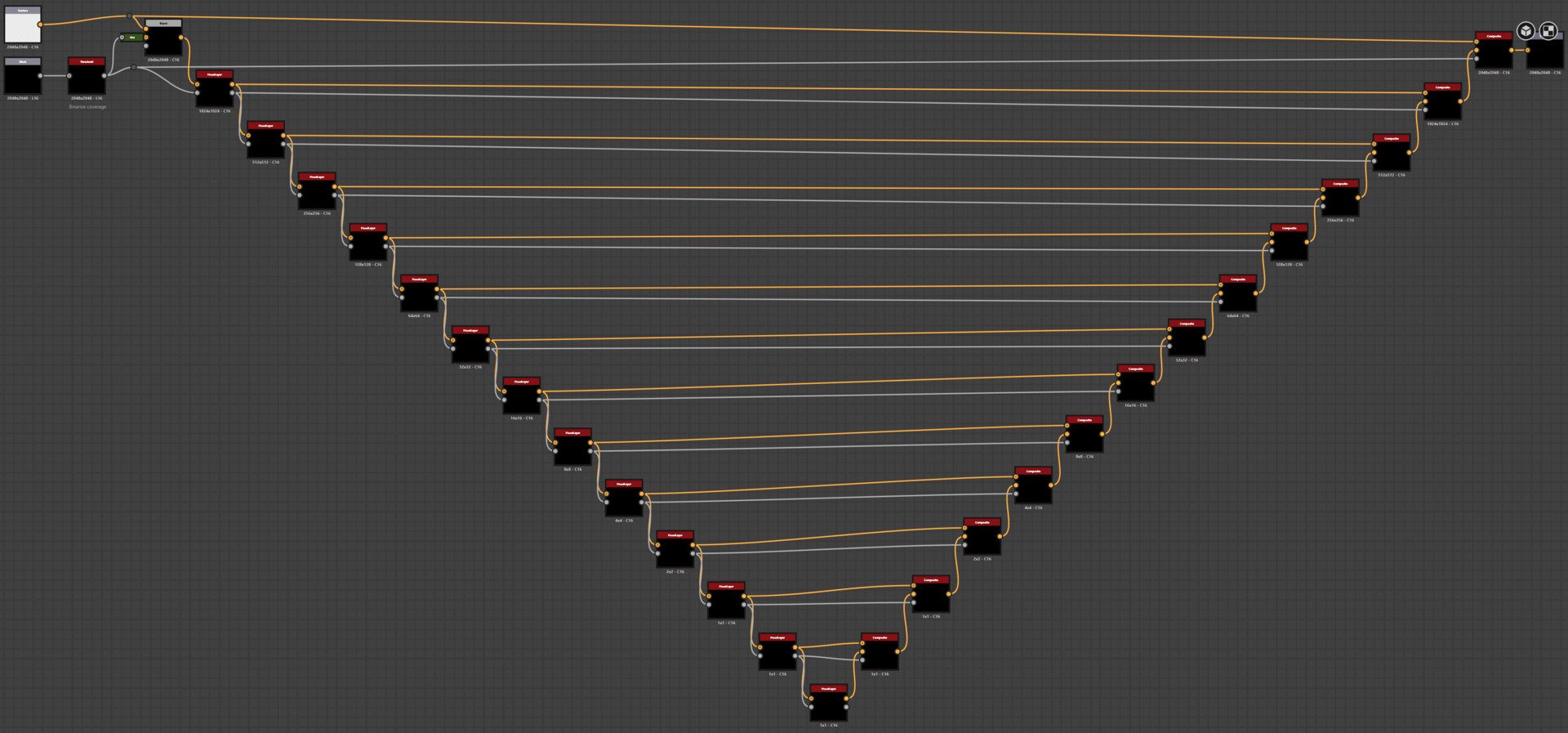
The Flood Chain

Once the flood layer graph and the composite graph are ready, a third graph can be set up:

This graph is as repetitive as it looks. For each mip, the flood layer node scales down the previous mip, and the mips are then combined in the composite map node. There are two steps before the layering: The mask is thresholded before the first loop, just like the mipped masks. And the original texture is multiplied by the mask. While this leaves the areas outside the mask black, these black areas won't be visible in the final result as long as all the mips are created and composited, and it prevents pixels from outside the masked area from bleeding into the final result.

Note: If you're like me, you're already wondering about the fixed number of layers, and you're right: Ideally, the number of layers should be equal to the number of mips. A 2048px texture should use 11 layers, a 512px texture should use 9 layers, and so on. This behavior could be implemented using switch nodes with function graphs to use only as many layers as needed.
I didn't implement this because using too many layers only increases the execution time but doesn't change the results. If you work with 8k textures, you may want to add another layer (and wonder what you actually need 8k textures for).

Creating the Mask

Now that the mip flooding graph exists, it can be used to optimize any texture, as long as a mask is provided. To create the mask based on the UV shells of a mesh, you can use the Convert UV to SVG baking tool:

Testing the Results

To test the implementation, I used a rock mesh from Unreal's Lyra sample content. In the screenshot below you can see the texture before and after the mip flooding was applied:

Although the mesh uses a very efficient layout, the texture size is reduced from 4.65 to 4 MB (-14%). Not bad for a technique that only requires a few clicks per mesh to make it work and doesn't degrade the visual quality of your game in any way.

Next Steps

Mip flooding can be used for almost any texture in your project, the only cases where you probably won't want to use it are tiling textures or UI textures. So the next step is to automate the process. Substance has an automation toolkit that can be used for this, but that is a topic for another article.
I hope you learned something from this article, or at least enjoyed it. If you did, please share it with others! If you have any comments, questions, or feedback, please post them below. To get new posts, follow me on Artstation.

Note: In a previous version of this post, I used the tile sampler to achieve nearest neighbor filtering because I didn't realize there was an option in the transform node to set the filtering method. Thanks to David Peryman for pointing this out.


If you enjoyed this article or found it useful, please share it with others! If you have any comments, questions, or feedback, please post them below. To get informed about new articles, follow me on Artstation, on Mastodon or Bluesky.

You can also find this article on my WordPress blog.

Using 27-sliced Meshes in Unreal

Tutorial / 09 April 2024

If you're familiar with UI design, you're probably familiar with how 9-sliced sprites work.

It's a technique that allows you to scale UI elements to any size by scaling only the middle part of the sprite, which usually doesn't contain any details that would show noticeable stretching. The edges are only scaled by 1 dimension each, and the corners don't change size at all.
This technique has been a staple of UI design for years, and as someone who spends more time working with 3D assets, it was always something I envied.
Especially when creating levels for games, the ability to freely scale 3D meshes without worrying about the stretching being noticeable can be incredibly helpful, as you can now better tailor meshes to the needs of the gameplay. And since I couldn't really see any reason why it shouldn't work in 3d, I implemented a 9-slice system in an Unreal material. Well, a 27-slice system to be exact.
So here it is, a breakdown of how the material works and how you can recreate it for your own projects:


The Material Function

It took some time to figure this out, but in the end it's not all that complex. The screenshot below shows the material function that calculates the WPO output of the material:

There are basically two parts:

  1. Calculating the offsets to move the vertices so that they remain in position relative to the outer edges of the mesh’s bounds

  2. Creating a mask that controls whether the offset is used. The object is stretched only  in the areas outside the mask.

Calculating the Offset

First, the distance between the current vertex and the edge of the boundary is calculated (as a vector, since the distance is needed for each dimension). Since this distance is always positive, it is then multiplied by the sign of the local position, so that the offset vector points in the right direction.
The next step is probably the least intuitive: The vector is multiplied by the object scale -1 and then divided by the object scale.
But it makes sense: By multiplying it by the object scale - 1, the offset is scaled to 0 when the object scale is set to 1, since no deformation is needed in this situation. But at the same time, this multiplication causes the offset to be scaled according to the object scale. Since the vector is later transformed from local space to world space, the scale is applied twice, so the vector must be divided by the scale.
The last step before the transformation into world space is the multiplication with the mask.

Calculating the Mask

This is the easier part. To create the mask, the local position is divided by half the size of the bounds. This creates a gradient (for each dimension separately) that goes from 0 at the center to 1 at the edges of the local bounds. Actually, it's -1 for the part of the mesh that goes in the negative direction, so the Abs function is needed to make the result symmetrical. This gradient is then used as input for an inverse lerp. This function returns a value between 0 and 1, depending on where the input value is between the A and B values. For values outside the A-B range, the values can be higher or lower, so the result must be saturated.

The result of the function can then be plugged into the material's WPO output pin. By adjusting the stretched area size and softness, you can control where the stretching should occur for each material instance.


Limitations/Requirements

For this technique to work properly, the meshes need to meet several requirements:

  1. The mesh needs to be created in its smallest possible state and then scaled up as needed. Scaling objects smaller than 1.0 can cause problems because vertices that maintain their original distance from the boundary edges can overlap with vertices on the other side of the mesh or even cut through the other end of the mesh.
  2. For best results, the meshes should have a fairly empty area in their center along the scale axis where the stretching can occur without being too noticeable.
  3. As with any vertex shader, the topology of your mesh becomes relevant, so when creating meshes to be used with this technique, keep this in mind and add edge loops where needed.
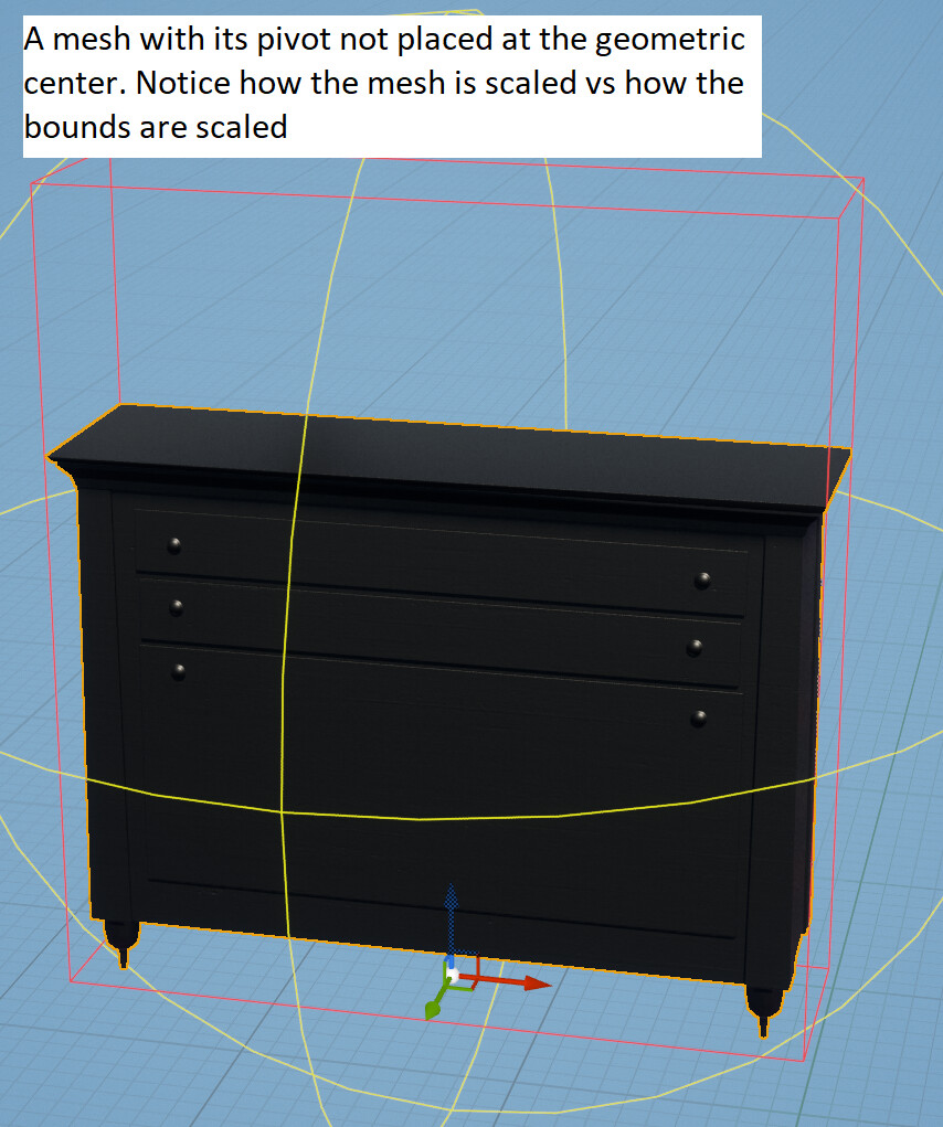
  4. The shader assumes that the pivot point is at the geometric center of the mesh/bounds. If the pivot point is somewhere else, the scaled object will not always scale correctly.


  5. This shader will not work with ISMs or HISMs because the individual instances do not have their own bounds calculated.

All of these limitations can be overcome with some modifications, but for this tutorial I wanted to stick to a basic approach.


Textures

While it's not the focus of this tutorial, I recommend using triplanar mapping for the textures if possible to avoid obvious stretching. Be aware, however, that Unreal's WorldAlignedTexture material function is a very expensive implementation, since the texture has to be sampled three times. I'd rather recommend using biplanar mapping or, even cheaper, rendering triplanar UVs to sample the texture just once. There are a lot of great resources on both techniques, so I won't go into detail here.


Results

And finally, the result of all these efforts: Furniture that can be scaled to any size without noticeable stretching:


Tutorial: How to create a Diablo-like resource globe in Unreal

Tutorial / 14 March 2024

One of Diablo's most iconic visuals (and, by extension, many of the games that have followed in its footsteps) is the UI's resource globes, which display the player's current health and mana points:

While they are technically just classic health bars, they have become a staple of the ARPG genre and exist in many variations.
So I was intrigued to create one myself, and luckily it can be done in a shader without having to create too many assets besides some generic noise/pattern textures. I'm using Unreal's material graph, but the techniques  are the same in other material-authoring sytems or when writing shaders hlsl/glsl.

This is the final result:


It consists of several elements layered on top of each other, and below I'll cover the creation of each element and how to combine them.
These elements are

  • The fluid
  • The glass sphere
  • The glowing edge at the fluid level.

But before I delve into the creation of these elements, some setup is needed because both the glass and the fluid need a sphere as a base to work with.

Creating the Sphere

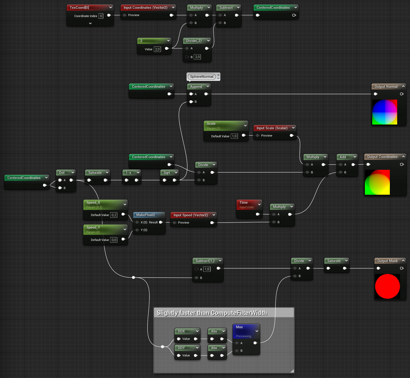
For both the fluid and the glass, you need the UVs, mask and normals of a sphere. You could use a texture for this, but since the sphere is such a simple geometric shape, it's tempting to just create it in a material function using math:

This material function is based on this code snippet by Ben Golus. It returns the normals, coordinates and a mask.
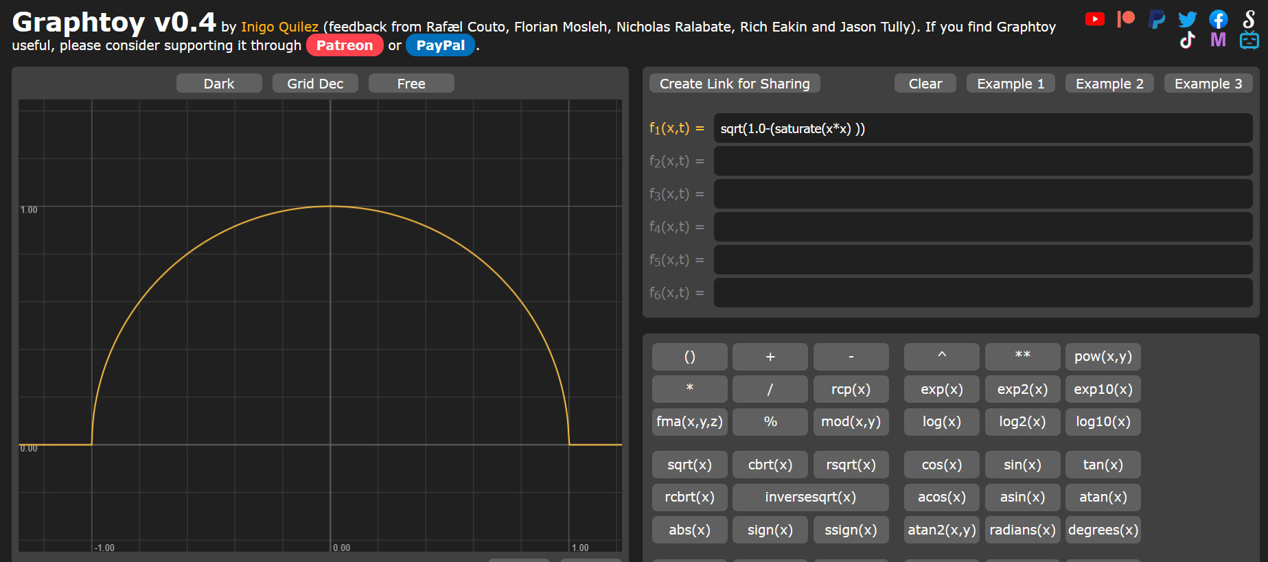
The x and y components of the normal are the centered coordinates, while the z component is the square root of the inverted and saturated dot product. This isn't exactly intuitive, but if you type this formula into graphtoy, you can see how the resulting graph shows the height of a sphere:

(Note that I didn't write dot(x,x) in the formula here, but x*x, which is equivalent).
To get the sphere coordinates, the centered coordinates are distorted by the sphere height, so that a texture mapped to these coordinates will appear smaller towards the edges.
The coordinates are also already panned in this function. This will be relevant later, as the fluid is supposed to move as if it's boiling, so having a panning function already in this function will help with that.
The last of the outputs is a mask, and while it's probably the easiest one to calculate, I want to stress the point that I'm not just using a step function or an if node to create the mask, but I'm dividing the distance to the edge of the mask by its derivative and saturating the result. This creates an anti-aliased edge with 0-1 values at the pixels directly on the edge.

Creating the Fluid

To create the fluid, I started by creating a matching texture in Substance Designer:

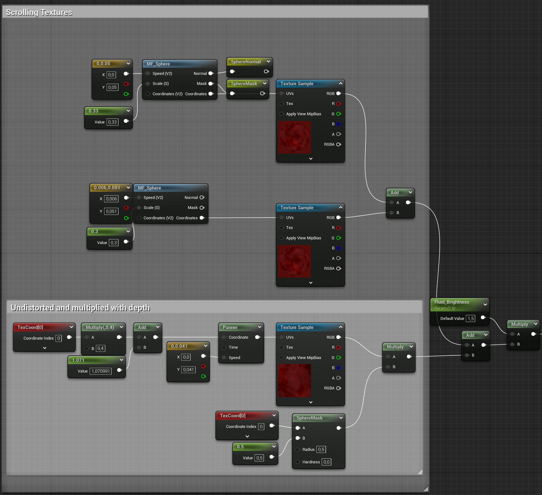
It's basically a cloud pattern with some spots and sparkles added to it. Looking at the texture now, a grayscale version would probably have sufficed and given me the option to add the color in the shader, but my inital idea was to work with two contrasting colors, before I switched to a classic amber red.

As already mentioned, the sphere material functions have a panning feature, and I'm using it here to have two layers with slightly different speeds and scales move on top of each other. On top of that, I added a third layer that uses undistorted UVs. While the fluid near the glass is the most visible, the fluid should have some depth, and the undistorted texture represents moving particles further inside the sphere. Instead of lerping between the layers, I just added them all together and added a multiplier to control the final brightness. In the screenshot above, you can also see that I pipe the normal and mask output of the first sphere material function into named reroutes, as they are needed in the remaining elements.

Creating the Glowing Edge

Since the bubble is supposed to display critical information to the player, it makes sense to highlight the position of the current fill level by adding a noticeable glow effect to it.
Before adding the actual glow effect, there needs to be a fill level to work with. And since we want the fluid to move, we also need some waves:

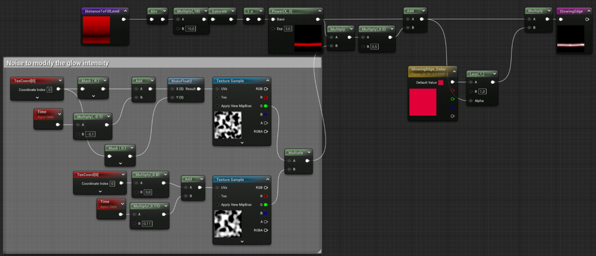
In this screenshot you can see how the waves are created. I use a panning texture, but map it to the U channel only, so Iget a gradient along the horizontal axis. This gradient is then centered around 0 and added to the V channel to create the wave effect. Then the fill level is subtracted (I had to add a 1-x node there to fix the direction). The result is the signed distance (along the vertical axis) to the fill level. The step function is used to create the fill mask. This function returns 1 for all pixels with values greater than 0 and 0 for all pixels with values less than zero. This mask will be used later for compositing. The other result of this part of the graph is the DistanceToFillLevel variable. This can be used to create the glow effect.

At its core, the Glow effect is just the inverted DistanceToFillLevel variable, adjusted by using a multiplicator and a power node. To add a sense of pulsating magical energy, two noise patterns panned at slightly different speeds are blended into it. To add some color, the result is then used to lerp between the actual desired color and pure white. This emulates the behavior of Unreal's tonemapper, which desaturates pixels as they get brighter. This emulates the behavior of real-world cameras and helps convey a wider range of contrast than the display is actually capable of.

Creating the Glass

Because glass is transparent, it is primarily visible through reflections and specular highlights. So to create the glass visual, it's enough to create the highlights.
To create a highlight, all you need to do is compute the dot product of a light vector and the surface normal vector illuminated by it, use a power node to control the size (the larger the exponent, the smaller it gets), and multiply it by a color to control its color and intensity. As you can see in the screenshot above, this is how the highlight for the button light was created. For the backlight, the dot product was inverted so that it comes from the opposite direction as the key light. For the edge light, the dot product is subtracted from 1 to get a Fresnel effect.

Combining the Elements

Once all the elements are created, combining them is relatively simple:The fluid is multiplied by the fill mask, and then all the highlights and the glowing edge are added. Since all the elements except the fluid are lights, just adding them works without any further blending operations. Finally, the sphere mask is applied to the opacity.

As you may have already noticed so far, all techniques used so far are relatively simple and isolated from each other, so it's easy to play around with the individual elements to try different looks and techniques. By adjusting the colors, used textures or just speeds and intensity parameters, you can create different versions for different kinds of resources.


If this post was enjoyable or useful for you, please share it! If you have comments, questions, or feedback, post them below. To get informed about new articles, follow me on Mastodon or Bluesky.

You can also find this article on my WordPress blog.
Tutorial - Adjusting Texture Sizes by Sharpness in Unreal

Tutorial / 20 January 2024

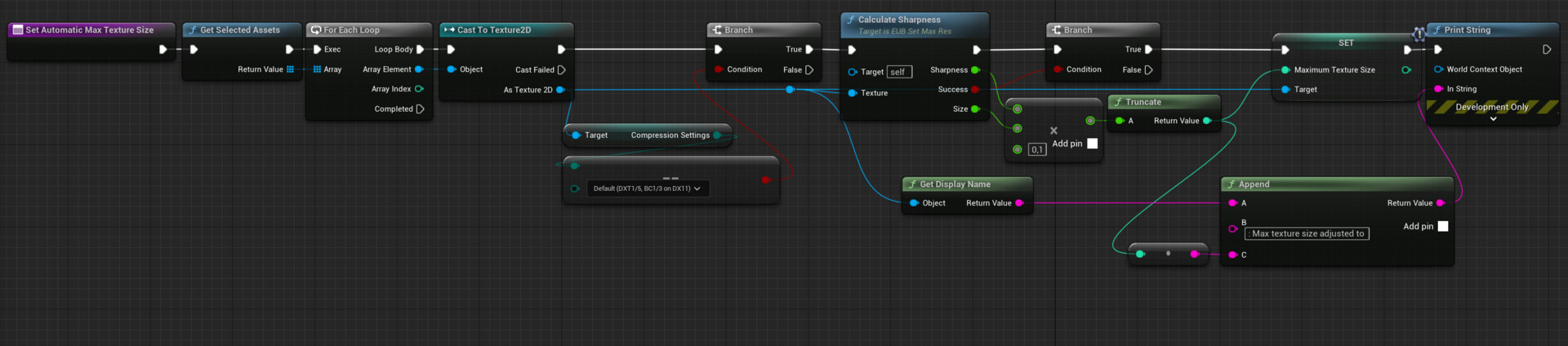
This article describes how to implement a system to adjust texture sizes in Unreal based on the sharpness of the source texture file. Blurry textures without much detail are reduced in size by this system.

The Problem

Very often when working on games you'll come across something like this:


A simple gradient texture using a resolution of 1024px * 1024px. While this texture contains more than a million pixels, the information stored in it is negligible. A 2x2 image could carry the same information with much less data.

Let's consider a less extreme case:

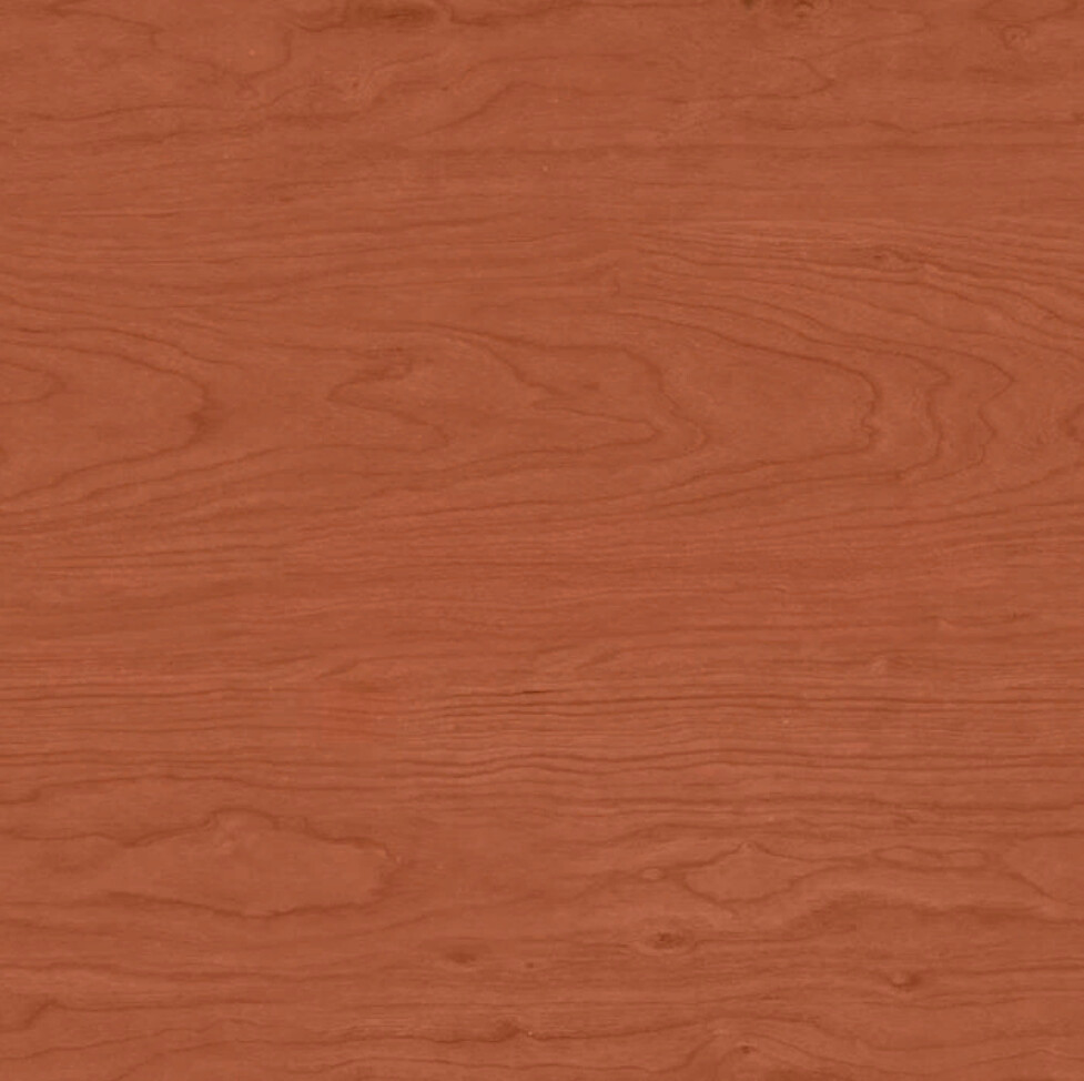
This wood texture contains more information, but if you look closely, you can see that the texture doesn't have fine-grain details. The large patterns are there, but the contrast between different pixels isn't that great. This texture can be scaled down without noticeable loss of detail to reduce the memory usage and build size of your game.

On the other side of the spectrum, you have a texture like this:

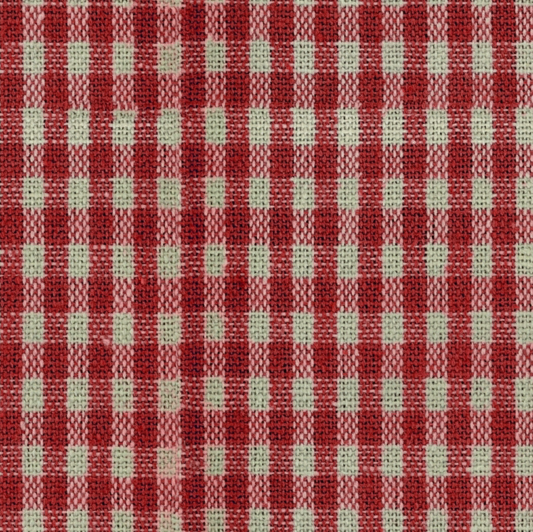
The detailed fabric structure and shadows in the crevices are easily lost once the texture is scaled down, so if you're under pressure to reduce texture sizes in your game, this is probably one of the last textures you'd want to touch.

Now, you could go through your entire project and manually adjust the texture sizes to make sure that each texture is only as big as it needs to be for its content, but in a large project that would take forever, and the results are likely to be inconsistent as you have to judge for each texture what texture size is still acceptable without compromising the visuals too much.

So let's see if there's a way to automate this.

Disclaimer

The implementation described below is the result of me trying out some ideas I have had for a while. However, I haven't used it in an actual professional production context, so please take my advice with a grain of salt. If you're implementing your own solution, be sure to tailor it to your project- and team-specific needs, and make sure the results are what you expect. That said, I think the basic principles of this implementation are sound, and some of the techniques used can be helpful in other contexts.

Step 1: Measuring Image Sharpness

The first step is to find a way to measure the amount of information. This is a huge topic in itself. First I found this article on calculating the entropy of images.

At first the results of this technique were quite promising, since the entropy gives you a good measure of the overall contrast in an image. But it quickly turned out that the entropy doesn't care about the frequencies present in an image, so even the gradient above had a rather high entropy, due to the presence of many completely black or white pixels.

Still, the fact that there are so many publicly available image processing libraries for Python was nice to see, so while I had to find another metric, I knew that I wanted to implement the measurement in Python. And very quickly I found another approach to evaluate image quality, by estimating the sharpness of the image.

The Python code used to measure image sharpness looks like this:

from PIL import Image

import numpy as np

import sys


def calculate_sharpness(image):

    array = np.asarray(image, dtype=np.int32)

    gy, gx = np.gradient(array)

    gnorm = np.sqrt(gx**2 + gy**2)

    sharpness = np.average(gnorm)

    return sharpness


if __name__ == "__main__":

    image = Image.open(input).convert('L') # to grayscale

    sharpness = calculate_sharpness(image)

    size = image.size[0]

Step 2: Installing the Libraries to Unreal's Python Environment

Now that the sharpness of an image can be calculated using Python, the next step is to actually use this logic in Unreal. But first we need to install some prerequisites. Since both the pillow library and the numpy library are used by the Python code, both are needed in the Python environment.

Unreal uses its own Python environment, not the one you have installed on your PC. So if you’re not used to working with Python in Unreal, here is how to install any additional libraries for Unreal's Python environment:

  1. Go to your engine folder and there into .../Engine/Binaries/ThirdParty/Python3/Win64
  2. Open the command line by typing cmd in the explorer's address bar and pressing enter
  3. The command python.exe -m pip install ModuleName starts the installation of the module

For the code above, both pillow and numpy are needed.

Step 3: The Asset Action

Now that the detail estimation has been figured out, let's start at the other end of the process, the user in the editor who wants to automatically adjust texture sizes.

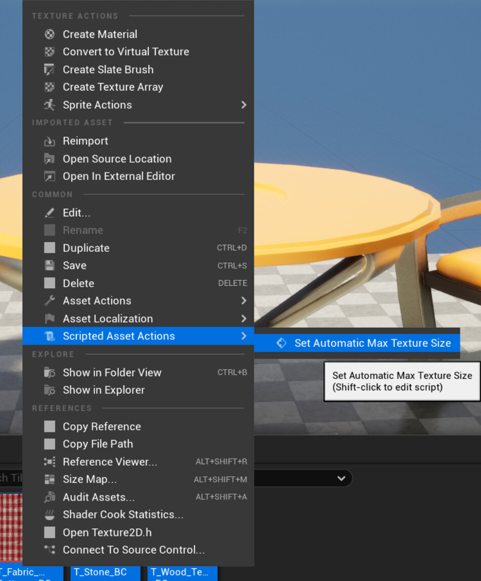
To expose options like this to the user, I'm a big fan of Unreal's Asset Action Utilities. Functions in these blueprints can be exposed to the asset context menu and called on multiple assets at once. You can find an introduction to them here.

The function that gets called by the user looks like this:

As you can see, the action only processes textures with the default compression settings. For now, I only want to use this tool on base color textures (see possible future works at the end of this article for why).

A texture with a sharpness of 5 and below will be halved in size, a texture with a sharpness of 2.5 will be quartered, and so on. The 10 is just a magic number, but can be adjusted depending on the desired quality.

Step 4: Calling the Python Code

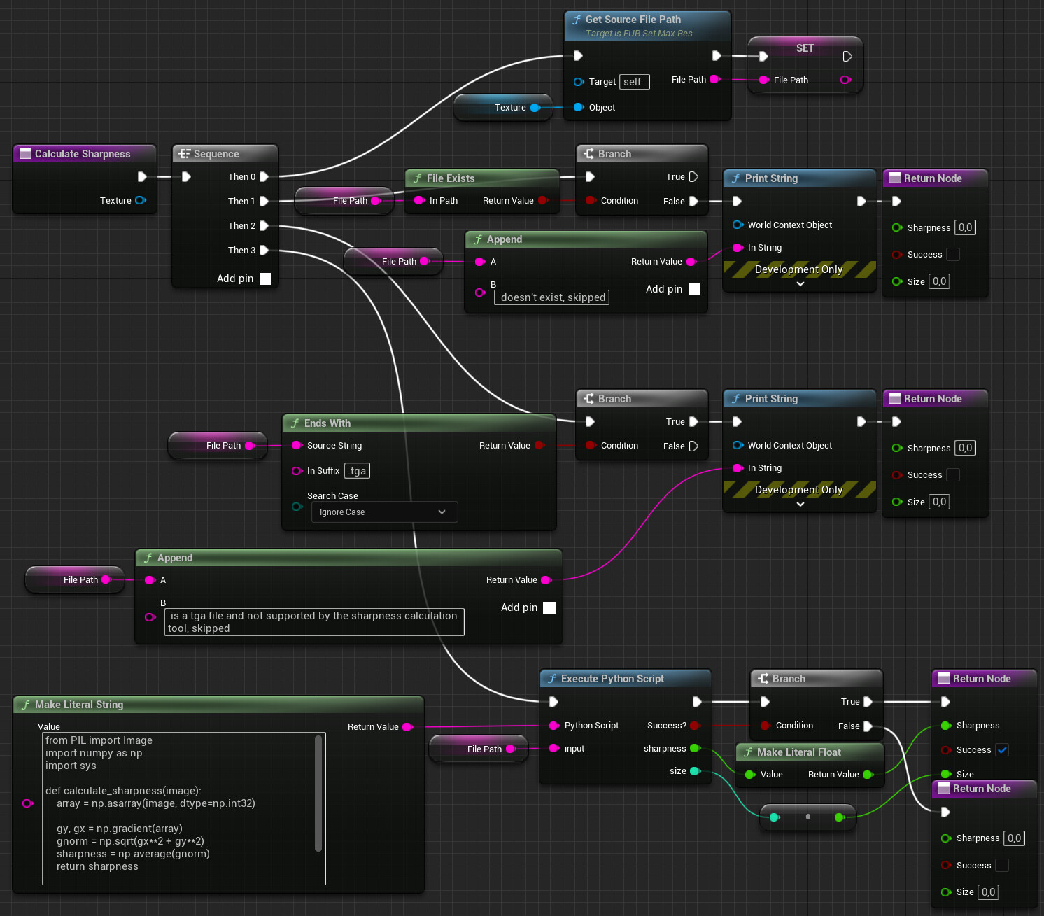
The next missing piece is the CalculateSharpness function. This function calls the Python code to get the sharpness. The Python code needs the file path of the texture's source file, which is provided by another function that will be covered in the next step. If the specified file path doesn't exist or the file is a .tga file, the function returns early without a result. I added the second check because pillow can't handle .tga files, but there are probably other file formats that aren't supported as well, so you may want to add additional checks if you're using other exotic formats.

To execute the Python code, the 'Execute Python Script' node is used. This node is the only Python execution node in Unreal that allows the use of input and output variables, so it was the logical choice. The only downside is that this node can't be used to execute .py files, therefore the code has to be stored in a literal string.

Step 5: Getting the File Path

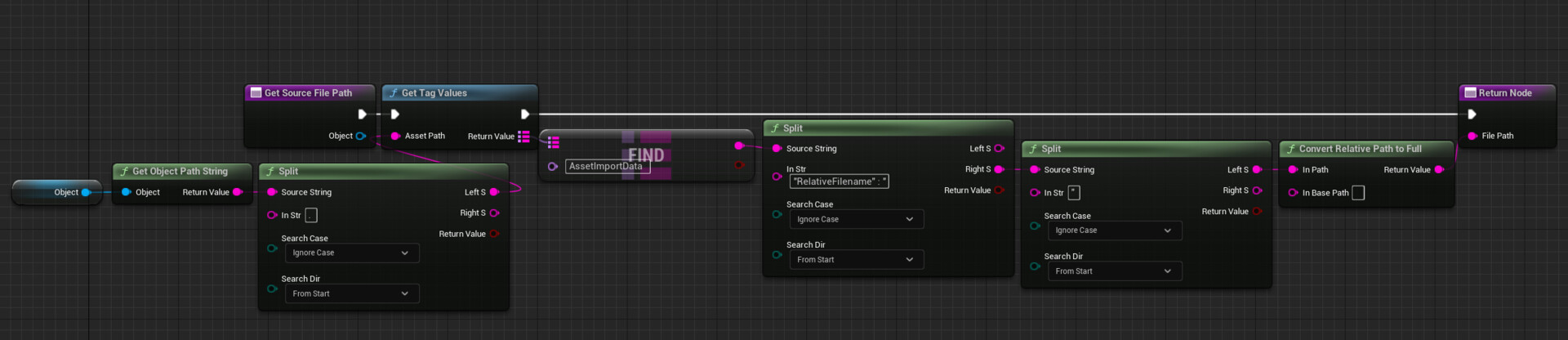
The GetSourceFilePath function returns the path to a texture's source file. This is a bit more complicated than you'd expect in Unreal. It can't be queried directly, but is stored in an asset registry tag, along with some other information. Therefore, some string processing is needed to extract just the path, which then needs to be converted to an absolute path:

Using the Action

The action can now be called on any number of selected assets in the Content Browser, allowing you to adjust texture sizes for the entire project with just a few clicks:

Known Issues and Future Work

While the estimated sharpness is a better metric than the entropy, it's far from perfect: Because it’s measured on a grayscale version of the image, it doesn't account for changes in hue or saturation, and human perception has its own quirks: The human eye is much better at detecting contrast differences in dark areas than in bright areas. It's also very good at recognizing patterns, so lines and repeating elements should actually be considered more important than random noise.

And while I'm focusing on base color textures for this article, normal maps and MRA maps do deserve their own customized algorithms: For normal maps, you should measure the angles between vectors instead of luminance differences. For MRA maps, you'd usually prioritize the quality of the roughness channel over the quality of the other two.

Depending on your pipeline, the need to have the source image file to be available may also be an issue, for example if you’re using textures from the Unreal Marketplace or if you're working in a team using version control and the art source files are not part of the workspace you're working in.


If this post was enjoyable or useful for you, please share it! If you have comments, questions, or feedback, post them below. To get new posts, follow me on Artstation.

Cheap Hex Tiling for every Occasion

Tutorial / 08 October 2023

Note: While this tutorial shows how to implement hexagonal tiling in Unreal, the techniques presented below aren't Unreal-specific and can be used in any shading language or node-based material system.

If you're an artist working on games with vast environments, you've probably run into something like this at some point:

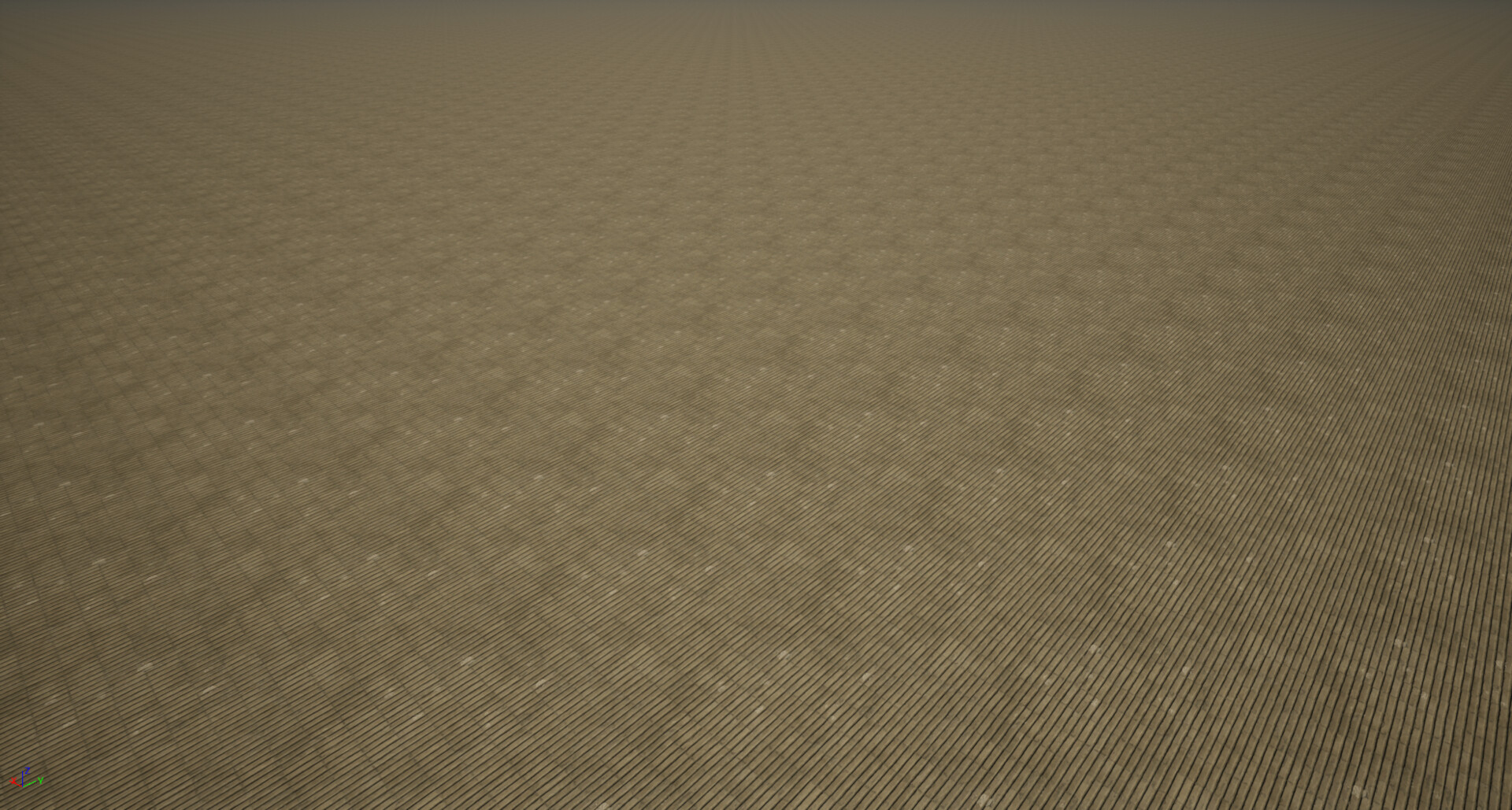
A texture covers a relatively small area, but is applied to a significantly larger surface, making it obvious that the texture is just repeated. There are ways to deal with this issue or at least make it less in-your-face:

  • You can tweak the texture to make the repetition less obvious. Maybe paint out some unique details that only matter up close, or use a high pass filter to even out the brightness across the texture.
  • Use detail maps to display textures with a different scale depending on the distance to the camera.
  • Add additional details like decals or extra geometric details, to break up the surface and hide the repetition.

All these methods don't really fix the underlying issue, there is still a grid-like repeating pattern, just not as noticeable. To really, truly get rid of it, you need to change how you're mapping the texture.
So as a start, let's rotate and offset the coordinates used in each 0.0-1.0 tile:

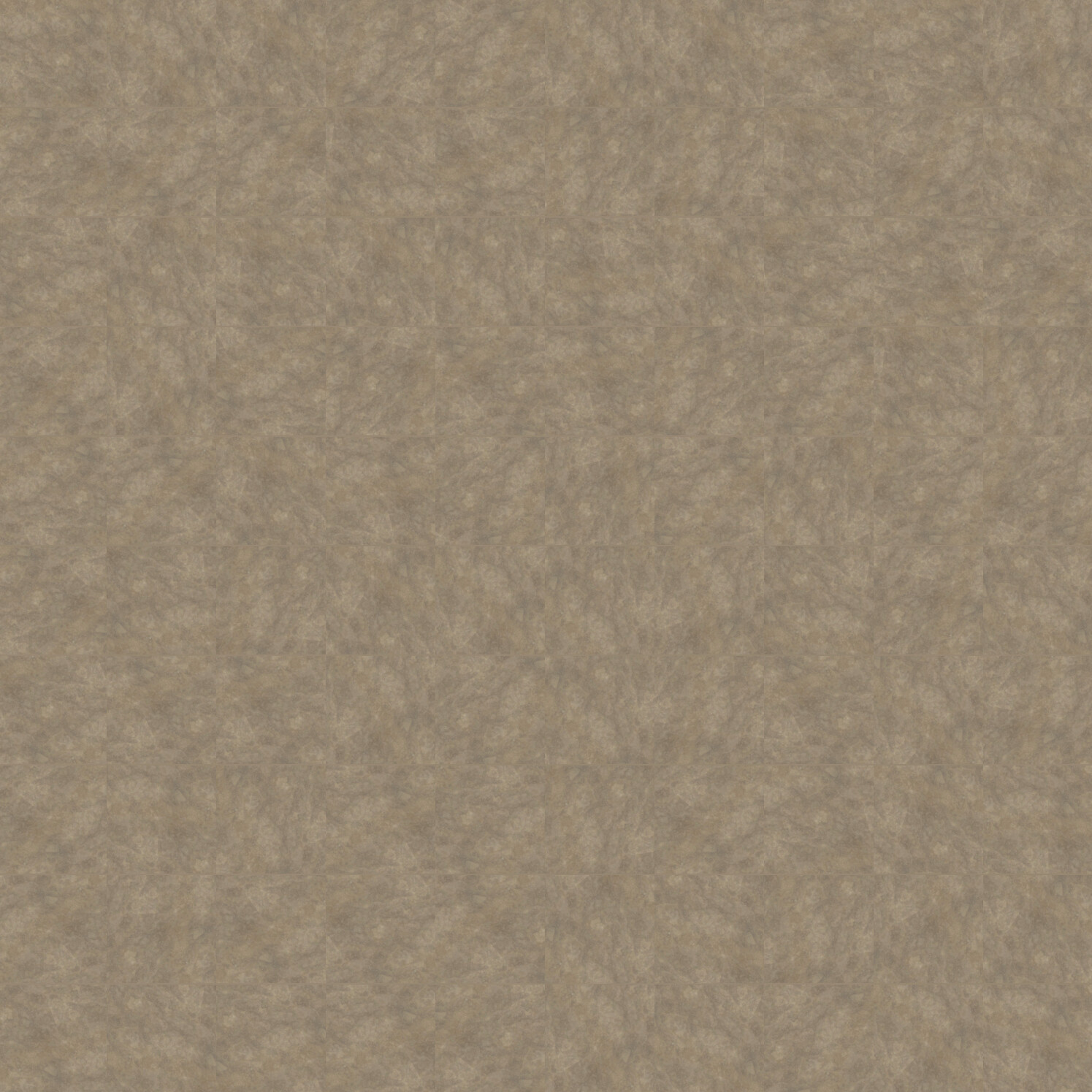
While the repetition has disappeared, the edges between the tiles are quite obvious. Can we improve this by blending between the individual tiles? Yes, but there is a drawback to this approach: Blending between the tiles necessitates multiple texture samples - specifically, four times, as there are four adjacent tiles at each corner.

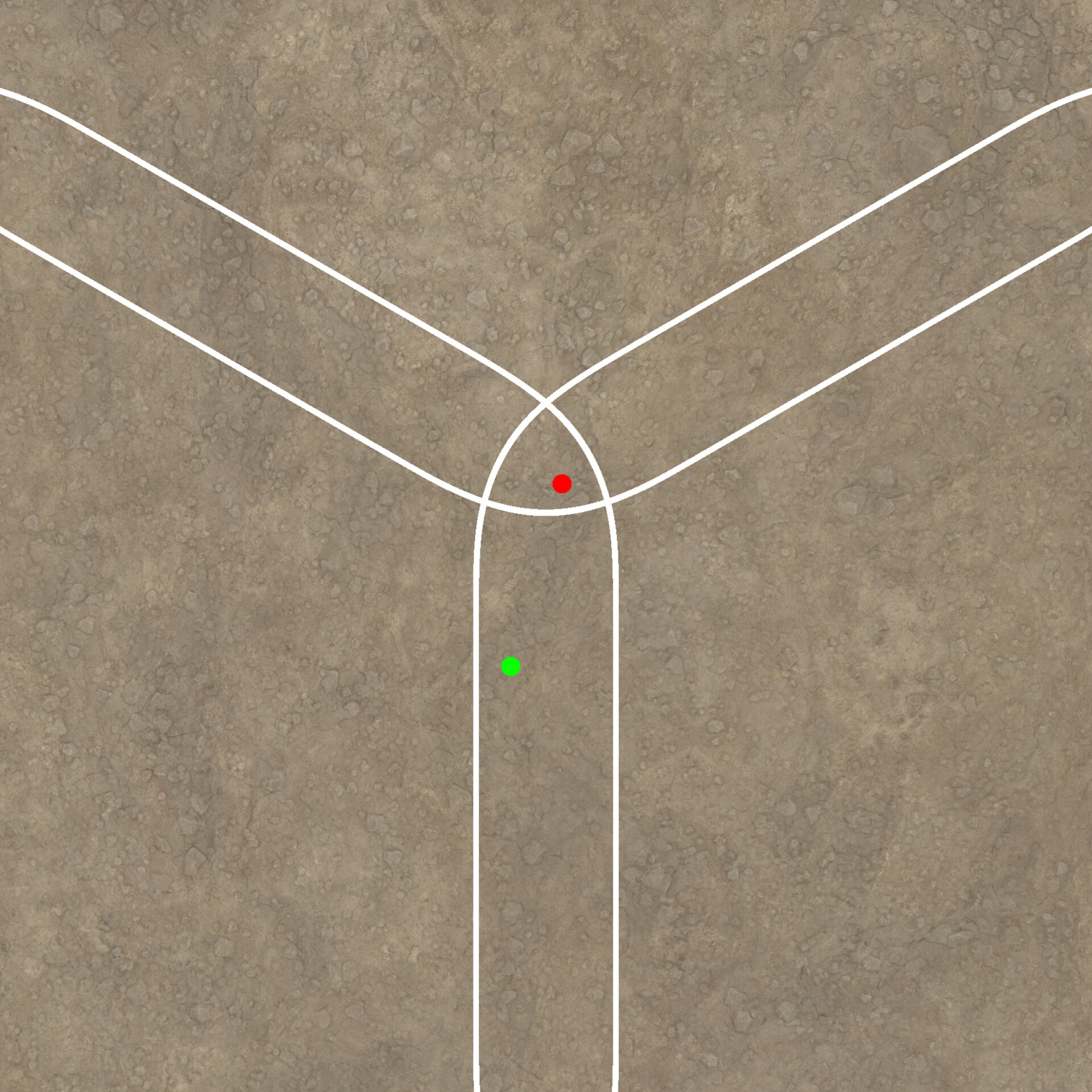
At the green dot, only two textures need to be sampled, but at the red dot, all 4 tiles are visible to some extent, so there is no way around sampling the texture 4 times. Surely there is a way to do this without affecting the performance that bad? Let's see what happens when we use a hexagon instead of a square as tile format:

Now, we only have to sample 3 textures at most. Plus, the hexagon structure makes it more difficult to notice the pattern, since there are no straight lines, making it more difficult for the viewer to spot the pattern.

Implementations

Hex tiling is a commonly used and well-tested technique. There are many great resources online on how to implement hex tiling:

  • Ben Cloward made an in-depth video tutorial: https://youtu.be/F7UxUgow4yg
  • When I tried out hex tiling, I used this paper by Thomas Deliot and Eric Heitz as reference: https://eheitzresearch.wordpress.com/738-2/ This implementation even employs histogram preservation to make sure that even with the texture blended multiple times, the contrast remains unaffected.
  • There is also this implementation by Morten S. Mikkelsen that builds on the previous paper but doesn't require additional precomputation steps: https://jcgt.org/published/0011/03/05/

All these implementations prioritize visual quality, and while they aren’t super expensive, the need to sample every texture three times instead of once wasn’t something I was super happy with. Landscape materials are notoriously complex, since they usually blend multiple layers of texture sets and incorporate various features like detail textures, noise overlays and modifications based on slopes or height.
So I wondered if I could make a cheaper version by sampling the texture only once, using dithering to hide the transitions.
While I'll explain below how I implemented this, I want to emphasize that I don't recommend this approach for every situation.
This method doesn't reach the quality of proper blending. Using dithering instead of proper blending is always a compromise, and depending on your quality expectations, proper blending might be the way to go.

Dithering

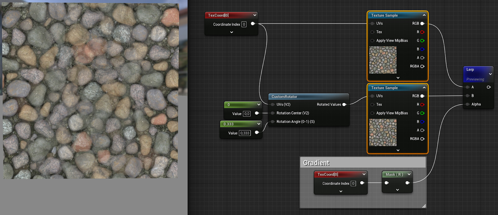
Whenever you find yourself needing to sample a texture multiple times and blend the results, it's worth considering whether you can achieve the same effect by blending the coordinates using dithering and then sampling the texture with the blended coordinates.

Now let’s try the same with applied dithering on the weights: In this example, a texture is sampled with two different coordinates and the results are then blended.

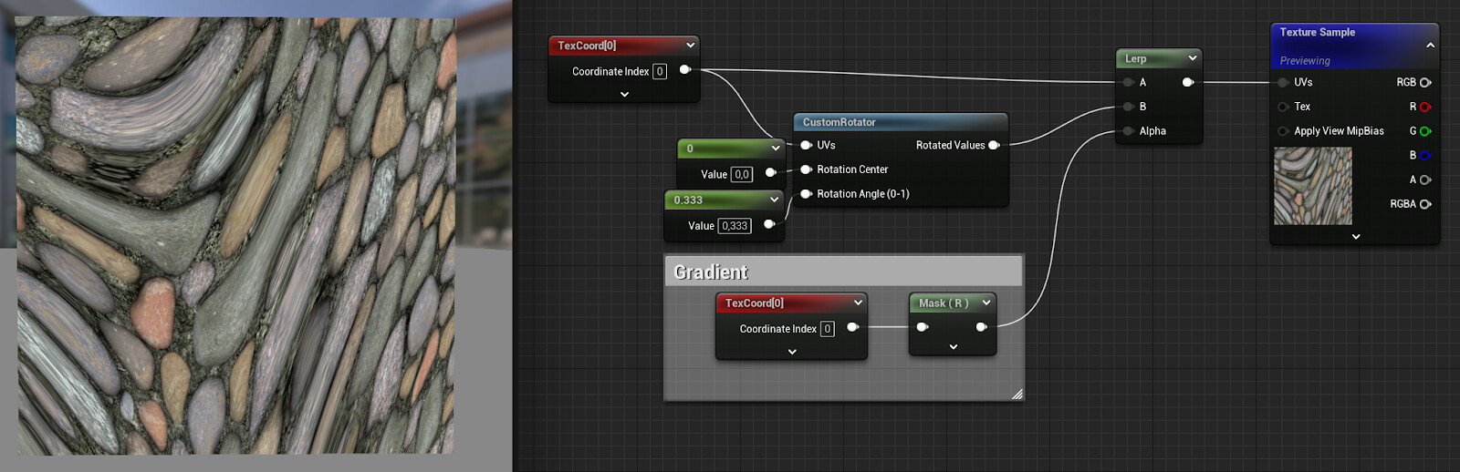
Now, just for the sake of it, this happens when you just blend the coordinates instead of the textures and then sample the texture once:

Obiously, blending UVs doesn't make sense, but let's what happens when we use dithering to use only one of the two UVs per pixel:

Better, I guess? It already resembles the blended textures, but the transition looks ugly. The reason for that is the mip-map calculation. When sampling a texture, the mip-map to use is calculated by looking at the difference between the coordinates of the current pixel and the coordinates of the previous pixel. The bigger this difference, also called derivative, the smaller the resolution of the mip-map to be used.
But due to the dithering, the coordinates of the previous pixel are completely unrelated and way off, so the texture is sampled as if it were far away from the camera, using a mip map with a lower resolution.
With mip-mapping disabled, the transition area is cleaned up:

That’s not the actual solution to this problem, though. Mip maps exist for a reason (multiple ones, to be exact). Without mip-mapping, the texture can't be streamed in, and is loaded at full resolution.
And if you don't care about memory usage, sampling the texture at full resolution even in the distance won't look great, as shimmering is introduced.
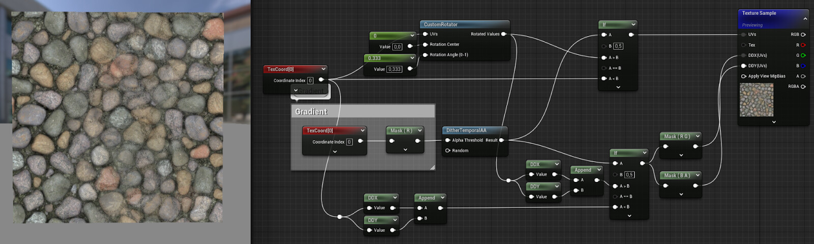
Thankfully, you don’t need to rely on the automatic derivative calculation, you can also specify them manually. In the example below, the derivatives for one of the coordinate sets are calculated and then used throughout:

This works because even though the second UVs are rotated differently, the scale remains the same, so even if the derivatives differ slightly, most of the time the same mip-map is going to be used.
Now let's rotate the derivatives as well:

The visual difference isn’t noticeable in this case, but with flatter viewing angles, not rotating the derivatives together with the coordinates can make a difference. But then again, using dithering instead of actual blending is already a far bigger compromise, so I don't feel bad about skipping this step.

Building the hex tiling material

Setting up the coordinates

After having looked up other implementations of hex tiling, I started building my version using dithered UVs.
The first step is to create three separate layers with coordinates:The TriangleGrid node contains custom hlsl code borrowed from Thomas Deliot and Eric Heitz:

// Scaling of the input
uv *= 3.464; // 2 * sqrt (3)
// Skew input space into simplex triangle grid
const float2x2 gridToSkewedGrid = {1.0, 0.0, -0.57735027, 1.15470054};
float2 skewedCoord = mul(gridToSkewedGrid, uv);
// Compute local triangle vertex IDs and local barycentric coordinates
int2 baseId = int2(floor(skewedCoord));
float3 temp = float3(frac(skewedCoord), 0);
temp.z = 1.0 - temp.x - temp.y;
if (temp.z > 0.0)
{
    w = temp.zyx;
    vertex1 = baseId;
    vertex2 = baseId + int2(0, 1);
    vertex3 = baseId + int2(1, 0);
}
else
{
    w = float3(-temp.z, 1.0 - temp.y, 1.0 - temp.x);
    vertex1 = baseId + int2(1, 1);
    vertex2 = baseId + int2(1, 0);
    vertex3 = baseId + int2(0, 1);
}
return 1.0f
;

I recommend reading the paper to get a better understanding of what this code does. The most important thing to understand is that while the technique is called hex tiling, the shapes that are blended together aren't hexagons, but the adjacent triangles that make up each hex tile

The node returns:

  • a float3 containing the weights of the triangles
  • three float2s containing index values of the hexagon containing the current triangle.

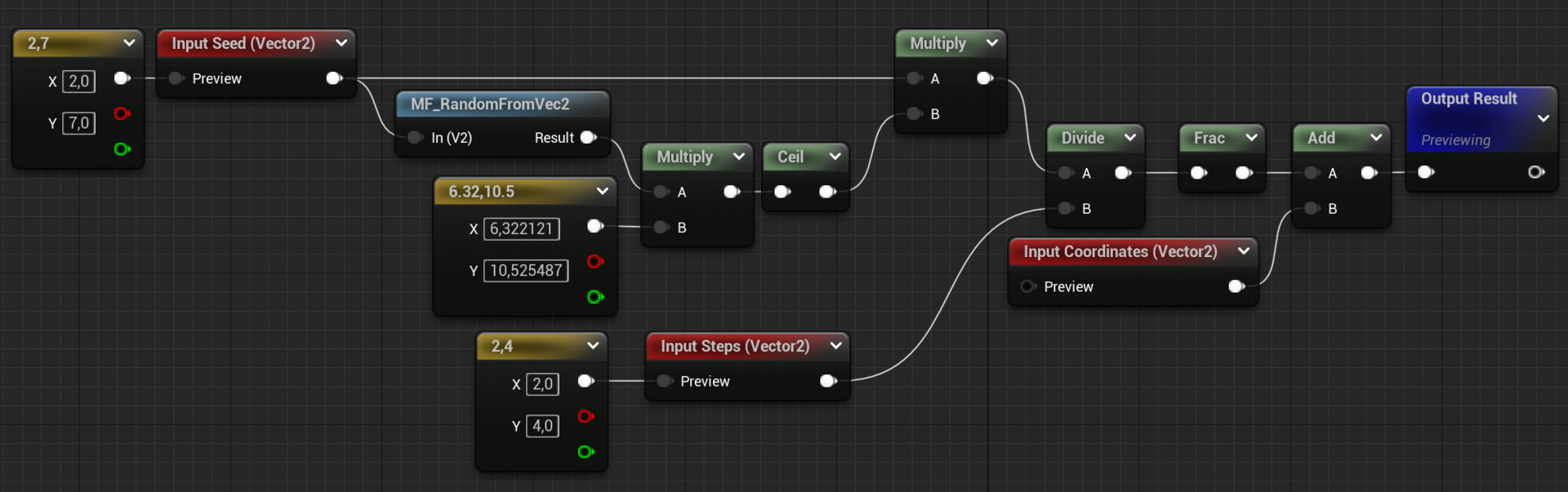
The hexagon IDs are subsequently used to compute random values for the tiles. This is what the hash function for that looks like:

These values are then employed as angles to rotate the coordinates. Afterwards, the angles are appended to the coordinates, since you'll need them later on.
As you can see, in my material graph, there is an alternative to rotating the coordinates, called stepped offsets.

Stepped Offsets

Rotating the coordinates works very well for chaotic, directionless surfaces like grass, dirt or concrete. But as soon as a texture has a noticeable orientation (like wood grain), randomly rotating the tiles will break it. Therefore, I added the option to just shift the coordinates instead. And since there are many cases where textures contain grid-like structures, the offset is applied in discrete. For instance, if your texture consists of 10x10 plates, you can set the Steps_U and Steps_V parameters accordingly so that the UVs are only offset in 0.1 steps, ensuring that the gaps between the plates still align with each other.

This is the Stepped Offsets material function:

Below you see a comparison between stepped offsets on the right and non-stepped offsets on the left:

Combining the Coordinates

Now that we have the coordinates, let's combine them:

The combined coordinates are then used to sample the textures. Remember to use derivatives that are calculated using the original coordinates before the offsets or rotations were applied!

Another important detail: Whenever you rotate UVs, make sure to rotate the normals accordingly the other way around, otherwise they'll point in the wrong direction. That's the reason why the angles were appended to the coordinates earlier.

The Results

Here is a comparison of classic tiling, hex tiling with random stepped offsets and with random rotations.

Since the texture doesn't have that much contrast, dithering works very well in this case, but your mileage may vary. The focus of this implementation was versatility (hence the option for stepped offsets) and speed (hence the dithering instead of sampling the texture multiple times).

It has its limitations though if it comes to quality. I wouldn't recommend adding parallax mapping for example, since it will break in the transition areas. Still, if you've read this article up to this point, I'm hoping I could provide you with some helpful insights that will turn out to be helpful. If you come up with any changes or improvements to this implementation I'd be happy to know about them!


If this post was enjoyable or useful for you, please share it! If you have comments, questions, or feedback, post them below. To get informed about new articles, follow me on Mastodon or Bluesky.

You can also find this article on my WordPress blog.

Creating Starry Nights without Textures

Tutorial / 29 May 2023

The most common way to implement night skies in games is to use a nice looking cubemap texture. The result usually looks good. And since cubemaps are a common feature in most engines, it's usually a topic that doesn't get much attention. That is, until you're developing a game for a low-end platform with not much VRAM. Then you suddenly realize that your star texture is 26MB, which you really don't want to spend on a single texture. And since the distance to the sky never changes, there's nothing to be gained by streaming the texture, so it always loads at full resolution. And even though the texture is usually just one color, reducing the texture resolution isn't an option either. Because stars are so small, often covering only 1-2 pixels, they will simply disappear if the resolution is too low.
Since I wasn't really happy with the memory consumption of a cubemap just to display a few white spots in the night sky, I looked for other ways to render stars. In this tutorial I'll show you how to do this by creating a star field mesh and using a material to make adjustments at runtime. This approach doesn't use any textures at all, just a low-poly mesh and a simple material. I used Blender and Unreal for this, but all the features used for this technique can be found in other DCCs and engines as well. As a side effect, this technique also reduces the amount of GPU time needed to render the sky, since there is no cubemap to sample for every single sky pixel. This doesn't really make a difference, though, since the effect is greatest when the player is looking at the sky, which is usually a situation where GPU time is not an issue anyway because there is almost nothing on the screen.

Creating The Mesh

It all starts with a single quad that will be a star. There's not much to do with this quad, except to change the normals so that they point out instead of up:

This will be important later in the material, as you will be able to resize the stars later.
Next, copy the plane a few times and arrange the copies into a hemisphere:

The size of the quads doesn't really matter at this point, so they can be larger than you want the final stars to be.
While this mesh is starting to resemble a starry sky, there is still one step missing: In order to add color and size variation in the material, we need a way to identify individual stars. A random value between 0-1 per star is the easiest way to do this and can be stored in the vertex colors. Since manually editing the vertex colors can be tedious, I used this script by Michel Anders: https://github.com/varkenvarken/blenderaddons/blob/master/connectedvertexcolors%20.py
It assigns a random grayscale value to each mesh element. Similar scripts exist for every single 3d software out there, and I recommend using them, they can be used for so many other things that the initial effort to find them and get them to work is time well spent.

The mesh with the random vertex colors per star

Creating the Material

After exporting the mesh to Unreal, the next step is to set up the material graph:

The material setup in Unreal

There are three critical features in this material:
1. The vertices can be moved along the normals to adjust the size of the stars. This is important because you usually want the stars to be as small as possible without reaching sub-pixel size.
2. The vertex color is used to add random variation to the color and scale of the stars.
3. The vertex color is also used to hide stars. If their assigned value is below a certain threshold, all of their vertices are moved to the origin. This makes it easy to adjust the number of stars without having to go back to the mesh.
And voila, after placing the mesh in a level and assigning the material, this is the result:


Limitations

This way of rendering stars works especially well if you intend to separate other elements of your sky as well. I recommend creating the sky color procedurally in a shader (if you're using Unreal, the SkyAtmosphere system already has you covered) and having your clouds as separate objects, be they billboards, particle effects or real volumetric clouds. If you are primarily working with static levels, but want a lot of details like nebulae or other objects in the sky, the old reliable cubemap approach is probably the way to go.

By the way, if you really want to delve deeper into creating backgrounds with geometry instead of textures, this SimonSchreibt article explains how Homeworld 2 created some stunning vistas without any textures: http://simonschreibt.de/gat/homeworld-2-backgrounds/

Bonus Section

As you probably know, the human eye is most sensitive to light at the edge of its field of view. As a result, stars are often invisible when you look at them directly, but become visible when you look at them from the corner of your eye. You can easily replicate this effect in Unreal by multiplying the star's opacity by the distance from the center of the screen:


Whether you want to use this heavily depends on the visual target of your game: Do you want to emulate the human perception or rather have a cinematic feeling?


If this post was enjoyable or useful for you, please share it! If you have comments, questions, or feedback, post them below. To get new posts, follow me on Artstation.

Unreal Tutorial: 5 New Features In Unreal 5 To Improve Your Editor Tools

Tutorial / 16 June 2022

While most people are probably gushing over the visual fidelity of the Lumen system or the breathtaking details possible with Nanite, Unreal Engine 5 has introduced a lot of less spectacular features that are especially useful for tech artists and anyone else who’s creating tools for the Unreal editor. Sadly, these features are often not documented and only very briefly mentioned in the release notes, so it's easy to be not aware of them.

Since I’m currently in the process of moving a lot of editor tools from UE4 to UE5, I thought it would make sense to compile a list of new features in UE5 that make creating and using editor utilities easier. While not as flashy as some other features new in UE5, all these new features or blueprint nodes have the potential to save you a lot of time or nerves when working with the engine on big projects. While you can just move editor utilities from a UE4 project to a UE5 project without any issues, UE5 offers a lot of new options to improve the user experience, and just taking a few minutes to adjust existing tools can make a big difference. 

Color Customization

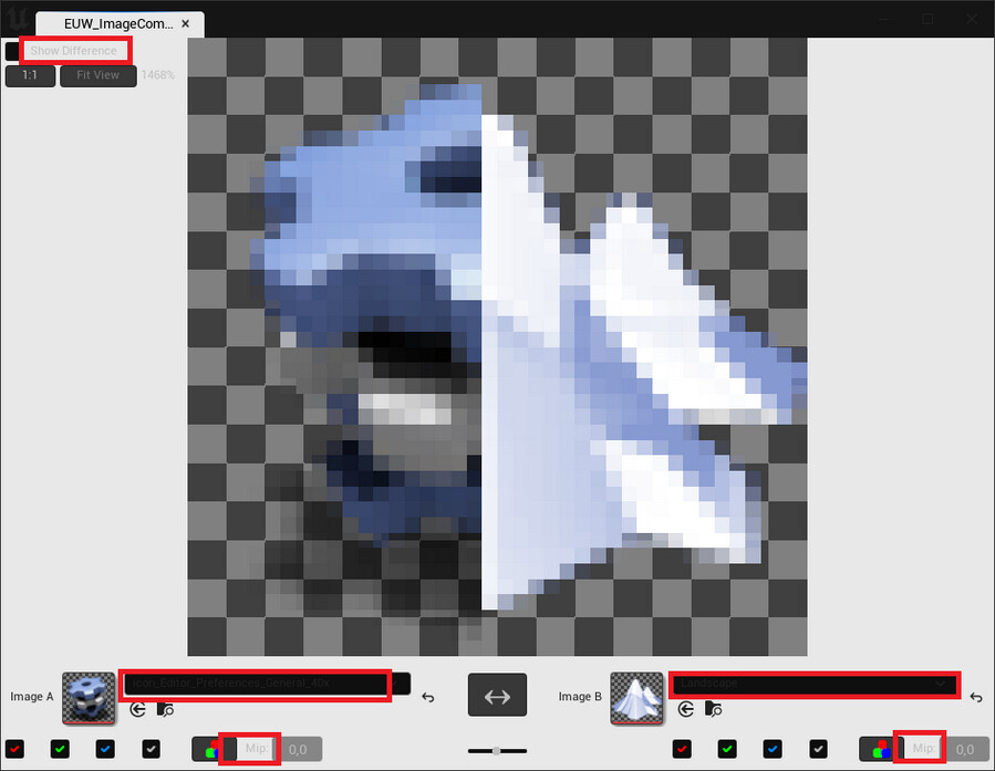
Since version 5.0, Unreal offers a lot more settings to customize the editor UI colors. This is something to keep in mind when working on custom UIs. Just using hard-coded color values may work with the default values, but can result in a mess if your tool is used by users who changed the settings. This is how my image comparison tool looked with adjusted color settings when I opened it in Unreal Engine 5 for the first time: 

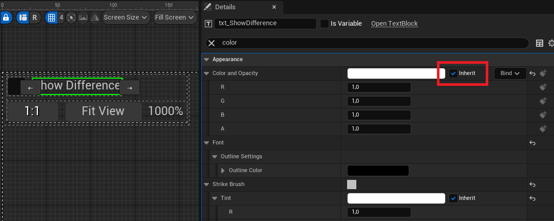
As highlighted in red, several texts are hard or impossible to decipher. Luckily, there is a way to deal with this. The utility widget is in fact aware of the current foreground color, and you can use it for your texts just by enabling the Inherit option on the foreground color setting:

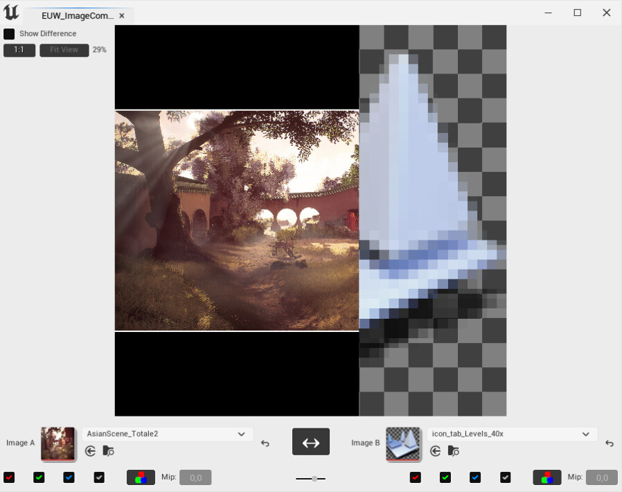
After a few adjustments, the UI is still readable even with heavily edited UI colors:

Disclaimer: I don’t recommend changing the colors of the Unreal editor’s UI to create a light mode. While the new customization options are a big improvement compared to previous versions, there are still a lot of UI elements that expect the default colors and will look weird with any colors adjusted. Still, you want your tools to work correctly for as many users as possible, so it’s a good idea to check how a tool looks even with a rather uncommon setup.

Asset Action Sub-Menus

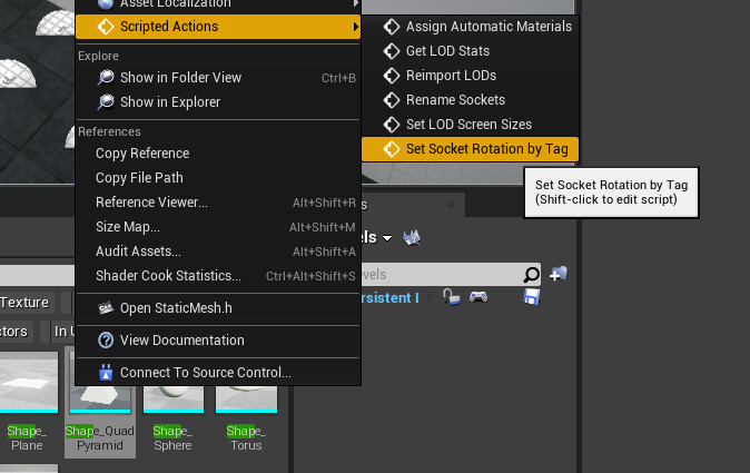
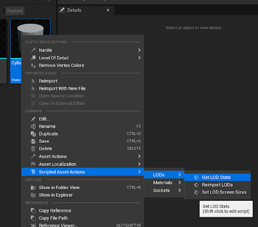
A very small, but helpful new feature in UE5: Asset and actor actions are now organized in sub-menus according to their categories. If you are an avid user of these actions, the menus in UE4 could get a bit messy:

But in UE5, everything is neatly organized:

So if your actions aren’t organized in categories yet, now is a good time to change that!

Object(s) Dialog

In UE4, when you wanted the user to edit/review assets, you’d open the default editor:

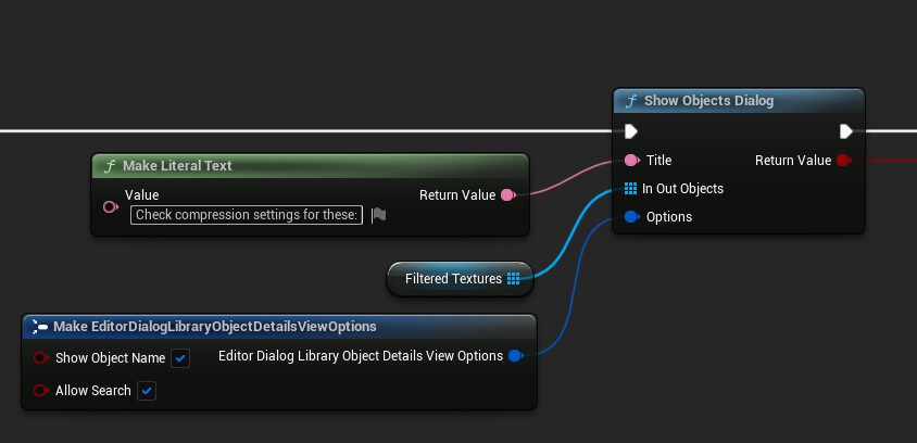
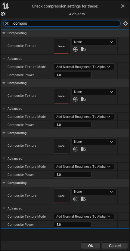
This would work nice for 1-2 assets, but once you want the user to edit dozens of assets at once, it’s not that great to use. UE5 has a new feature for this, the object(s) dialog:

The objects dialog basically combines several details windows into one, allowing you to review and edit the details of several UObjects at once:

Note: While the dialog has the option to confirm or cancel at the bottom, the changes you make in the dialog are applied instantly, even though the interface would make you believe otherwise.

Working With The Content Browser

Another handy new feature in UE5 is the Get Current Content Browser Path node. In UE4, there was no easy way to know which directory was currently opened. To work around that, you could get the selected assets and derive the current path from them, but this solution requires the user to select at least one asset, which isn't very elegant.

In UE5, you can easily get the current path, which is super helpful to iterate over all assets in the current director.

Working With Material Instances

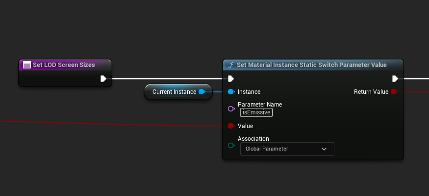
One of the really annoying omissions in UE4 was always the lack of a blueprint node to edit static parameters on material instances. The best you could do with out-of-the-box tools was to get the value and notify the user if it wasn't the expected one.
While there is a helpful tutorial to create it yourself, everyone who prefers to work blueprint-only (or doesn't understand Japanese) will be happy to see that finally, there is a blueprint node for that:

And in case you are curious how the new shader permutation affects the performance, UE5 has you covered. You can now get the complete material statistics you know from the material editor, making it possible to rank your materials by instruction counts or flag all material instances that exceed a certain complexity:


If this post was enjoyable or useful for you, please share it! If you have comments, questions, or feedback, post them below. To get new posts, follow me on Artstation.